Proof of Concept – Universal Search in Healthy 365 App
September 2026

The Proof-of-Concept
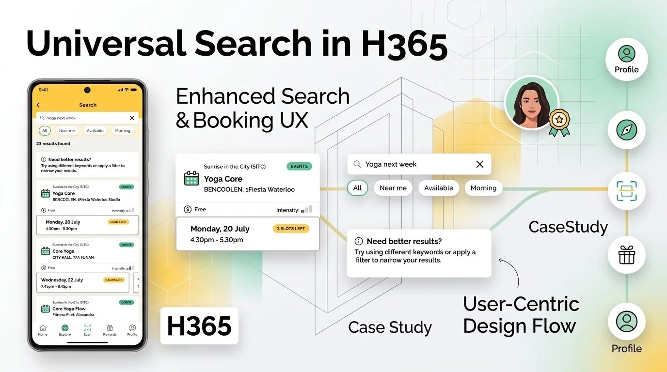
Design a Universal Search in Healthy 365 mobile application that transforms a fragmented, scattered experience into a single, intelligent interface — reducing friction, accelerating discovery, and laying the groundwork for smart, tailored recommendations.
Design Thinking Process
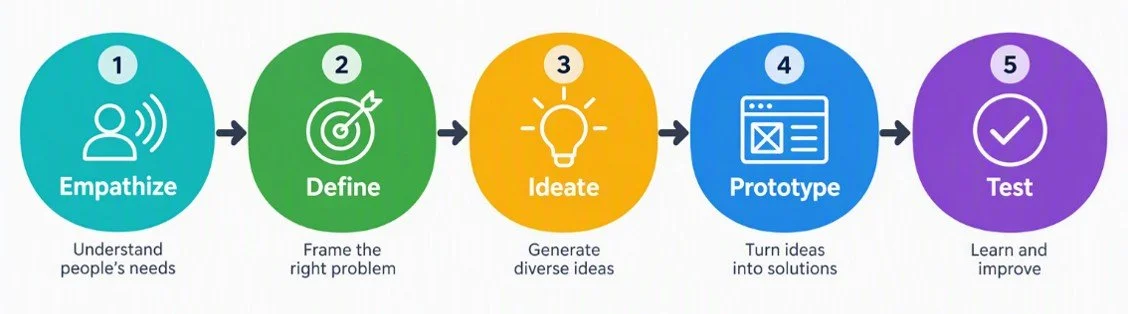
I applied the Design Thinking process to guide my designs from user insights through problem definition, ideation, prototyping, and testing, ensuring each solution was purposeful and user-centered.
Step 1: Empathize
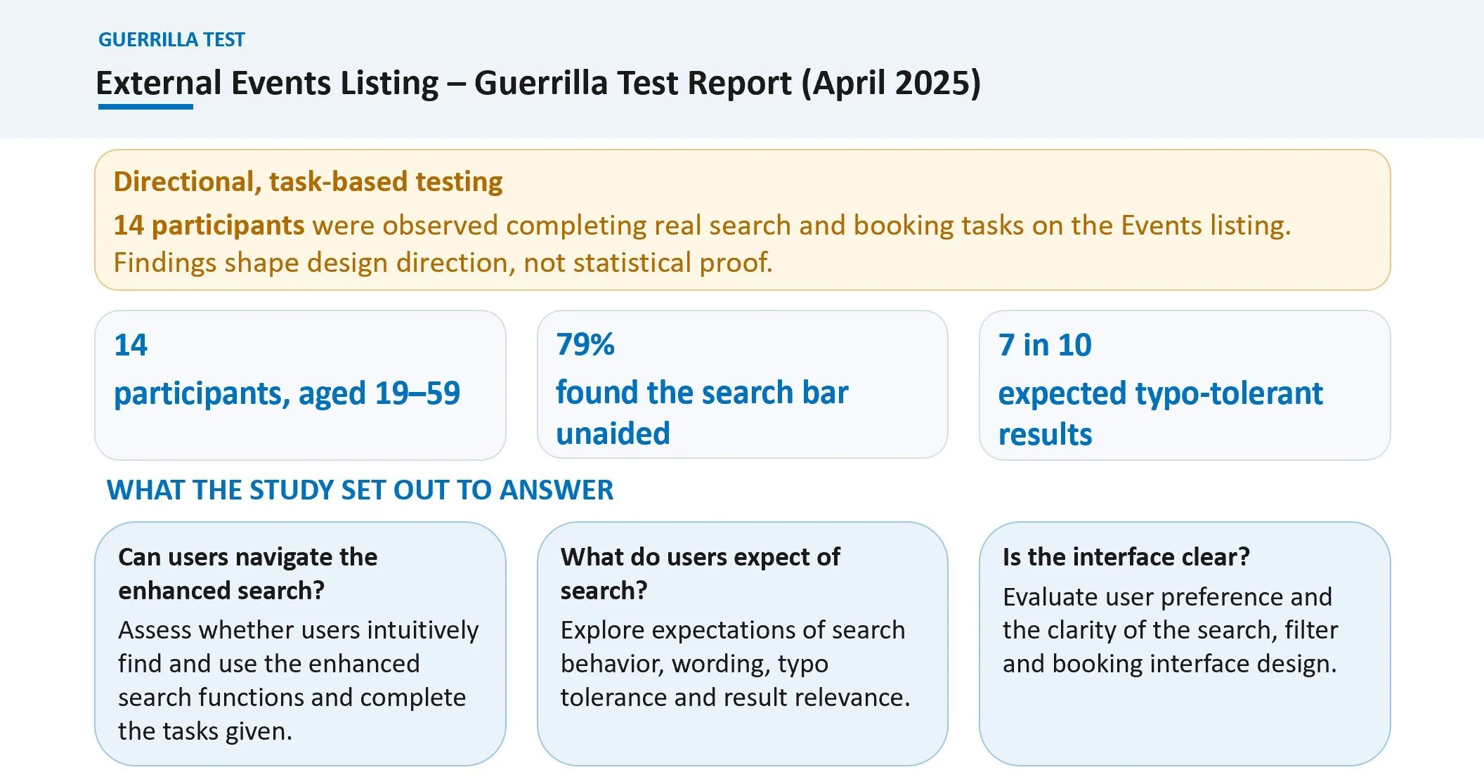
For this project, I drove the design strategy by synthesizing actionable insights from the business's raw guerrilla test report. Rather than starting from assumptions, I analyzed real-world behavioral data and user friction points captured during these rapid field tests to pinpoint exactly where the existing interface was failing. By anchoring my design thinking process in these authentic user struggles, I transformed the business's test findings into a structured design approach that directly answers our users' immediate needs.
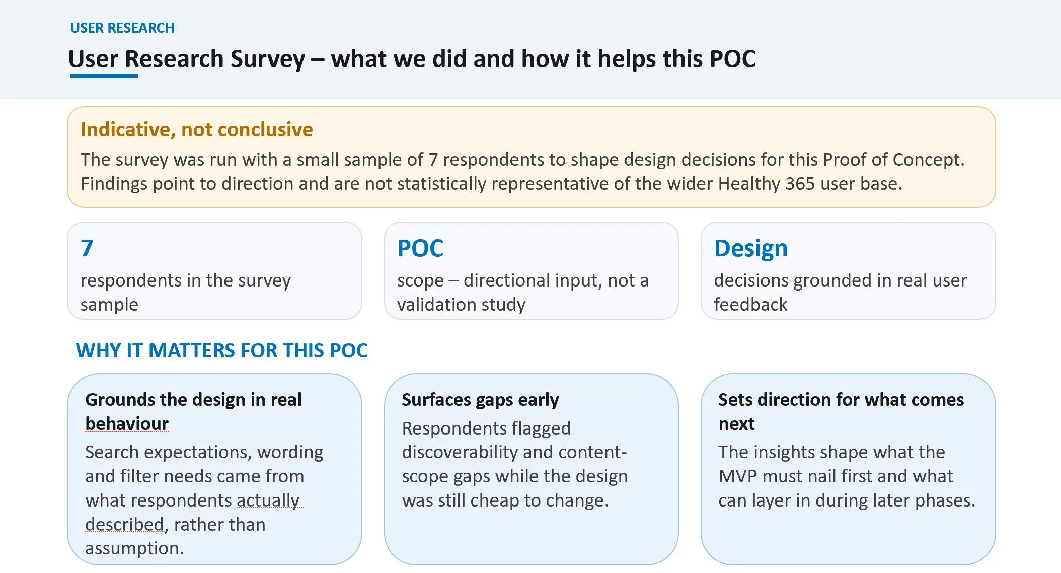
To further ground my design choices in real user behaviors rather than assumptions, I analyzed an internal user research survey focused on the Healthy 365 app experience. Operating as a directional Proof of Concept (POC) rather than a statistically conclusive validation study, the survey captured detailed feedback from 7 targeted respondents. This agile approach allowed me to surface critical content-scope and discoverability gaps while the design was still highly flexible. By synthesizing these direct user frustrations, I extracted six foundational insights and translated them into actionable design principles to guide our Minimum Viable Product (MVP).
Step 2: Define – From Research to Synthesis, Defining the Opportunities
With the foundational discovery completed, I transitioned from gathering raw user data to synthesizing my findings into actionable design direction. By cross-referencing the behavioral friction points from the business's guerrilla test report with the workflow frustrations captured in my department user research survey, common thematic patterns began to surface.
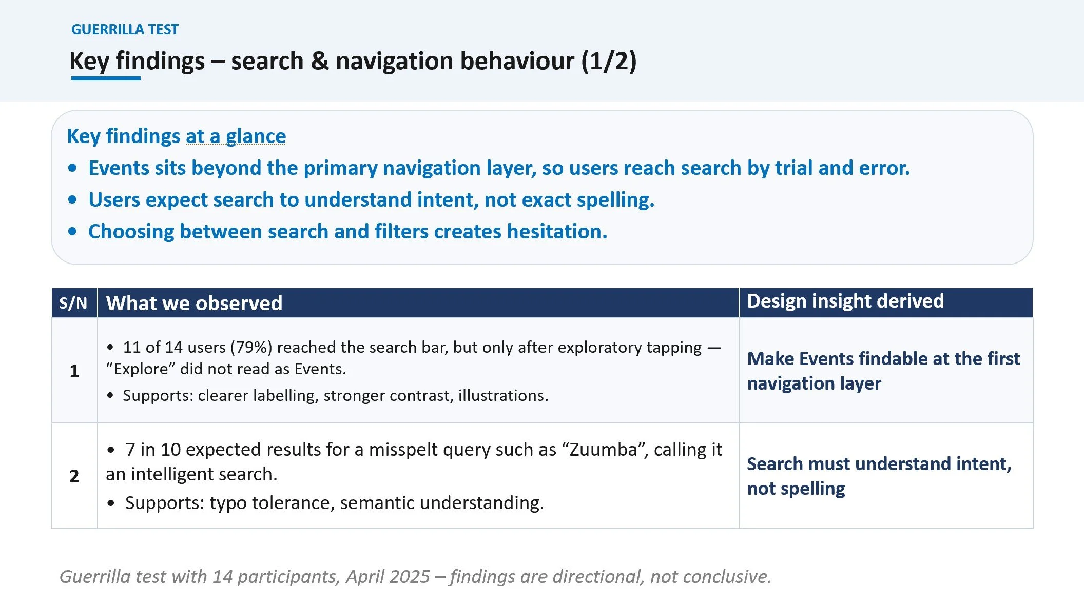
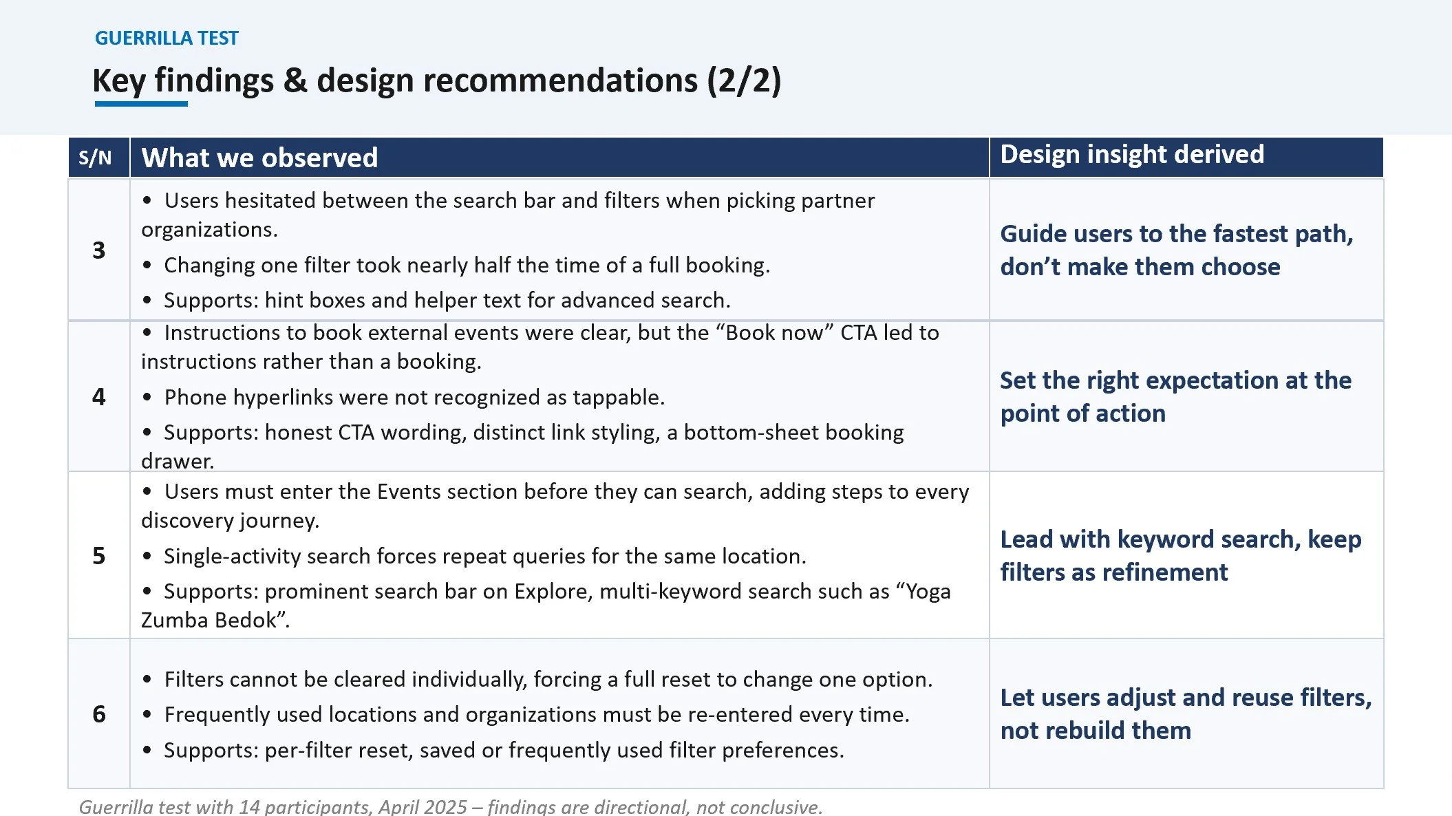
Guerrilla Test
Research Findings (Data Pool)
Guerrilla Test: 79% of users needed exploratory tapping to find search; "Explore" tab was ambiguous.
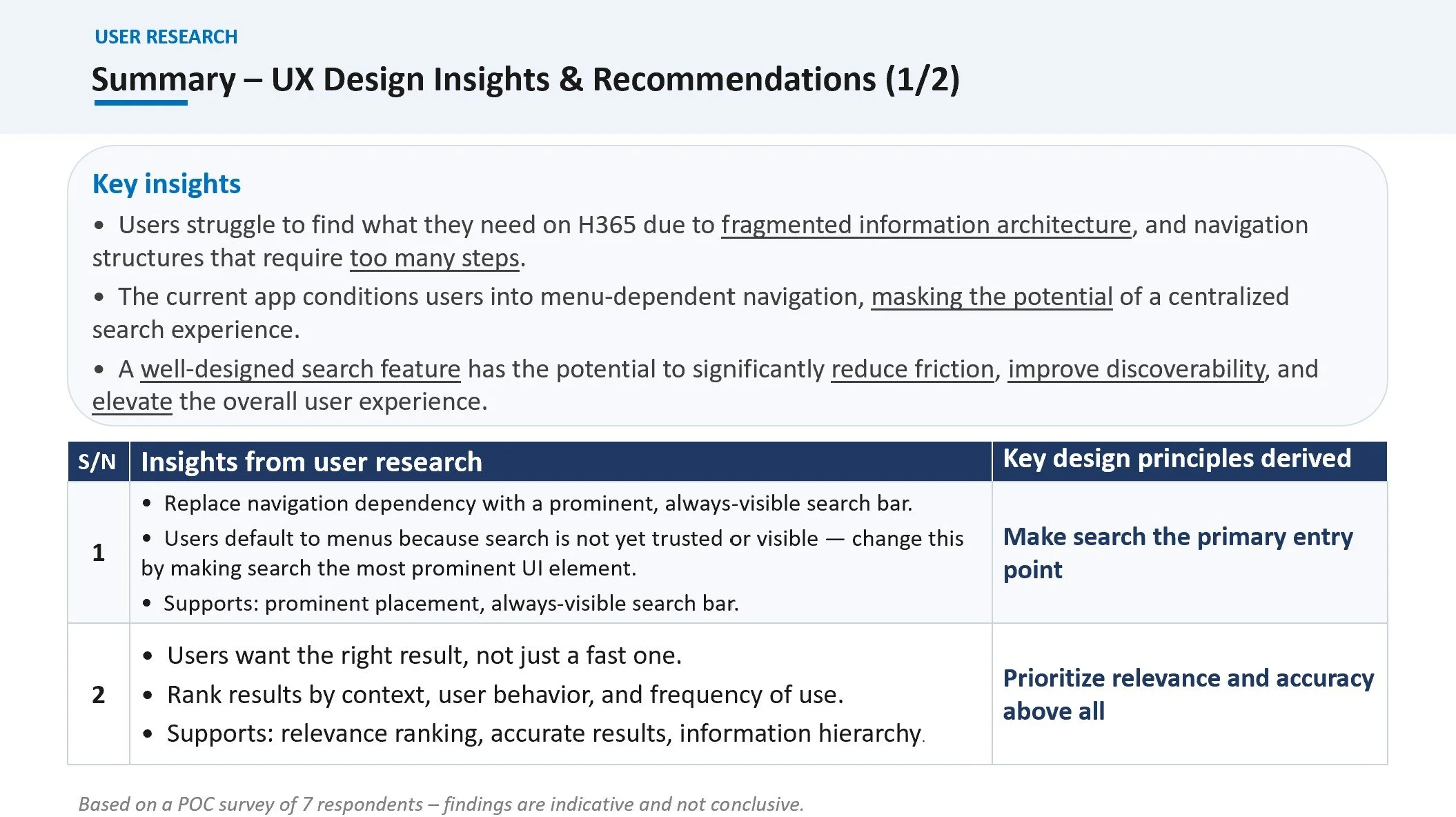
Survey: Fragmented IA forces menu-dependent navigation.
User Research Survey (Internal)
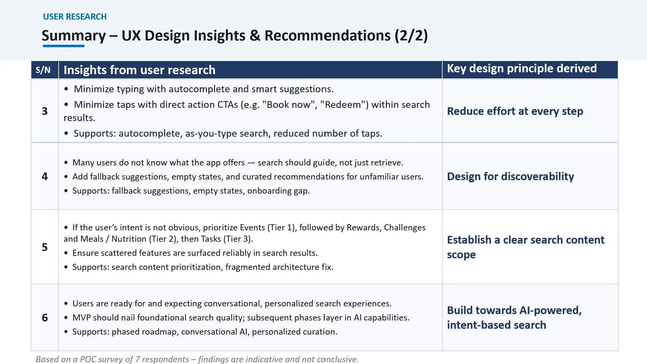
By cross-referencing the findings from the guerrilla tests with the insights from my user research survey, I identified three critical areas of overlapping friction. These intersections proved that the real-time behavioral struggles users faced during field testing directly mirrored the structural frustrations reported in the department survey.
Instead of treating these two research methods as isolated data sets, I mapped their overlapping insights to establish a singular, concrete source of truth. This synthesis allowed me to pivot from simply identifying problems to defining the core strategic principles that would guide our entire solution.
To ensure every subsequent design choice remained strictly anchored in user evidence, I organized these findings into a Research Traceability Matrix. Below is the visual map illustrating how specific user behaviors directly informed our identified pain points and established the exact evaluation criteria for our final design opportunities:
Research Traceability Matrix
Guerrilla Test: Users took half the booking time just adjusting one filter; preferences reset completely.
Survey: Users demand reduced effort, fewer taps, and clearer guidance.
Guerrilla Test: 70% of users expect the search bar to understand typo intent (e.g., "Zuumba").
Survey: Users want search to interpret behavioral context, not just exact textual matches.
Derived User Pain-Point
Domain-Restricted Access
Users lack a single, unified entry point to navigate across the H365 ecosystem.
Lack of Guidance
Without intelligent recommendations or smart defaults, users must independently hunt for features.
Knowledge Prerequisites
Users are forced to understand internal app structures and strict naming rules to find results.
How Might We?
How might we create a simple, unified entry point that eliminates menu layout dependencies and consolidates search?
How might we minimize interaction effort by introducing smarter feedback, reusable filters, and contextual shortcuts?
How might we reduce cognitive load by building intent-driven search capabilities that accommodate natural user behavior?
Problem Statement
H365 users struggle to navigate the platform and find information independently, increasing cognitive load and reducing engagement. The lack of a unified, intuitive entry point creates barriers that prevent users from fully utilizing the platform and achieving their healthy lifestyle goals.
How Might We (HMW)
How might we provide H365 users with a simple, unified way to find relevant information and features, reducing cognitive load and helping them achieve their healthy lifestyle goals?
Competitor Analysis – UX Benchmarking reference with Food Delivery App Discovery
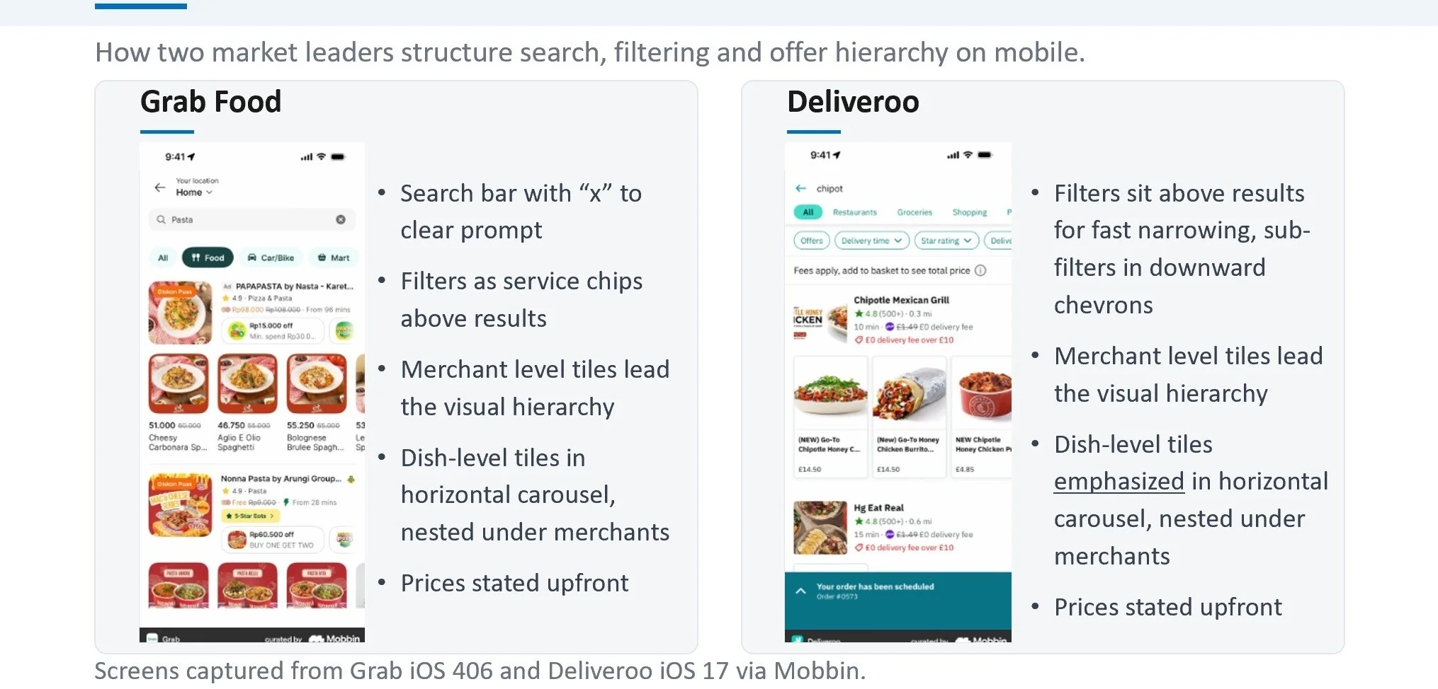
To transform my "How Might We" opportunities into functional interface layouts, I conducted competitor research by benchmarking market leaders in mobile discovery. I analyzed how Grab Food and Deliveroo structure search, filtering ecosystems, and offer hierarchies on small screens. Rather than guessing how to lay out complex content tiers, I studied these established patterns to understand the mental models our target users already rely on daily.
This visual audit allowed me to break down specific interaction mechanics — such as the use of service chips for fast filtering, horizontal dish-level carousels, and transparent upfront pricing. The following analysis outlines the proven UX patterns I referenced to ensure our proposed solution feels instantly familiar, intuitive, and efficient:
Step 3: Ideate
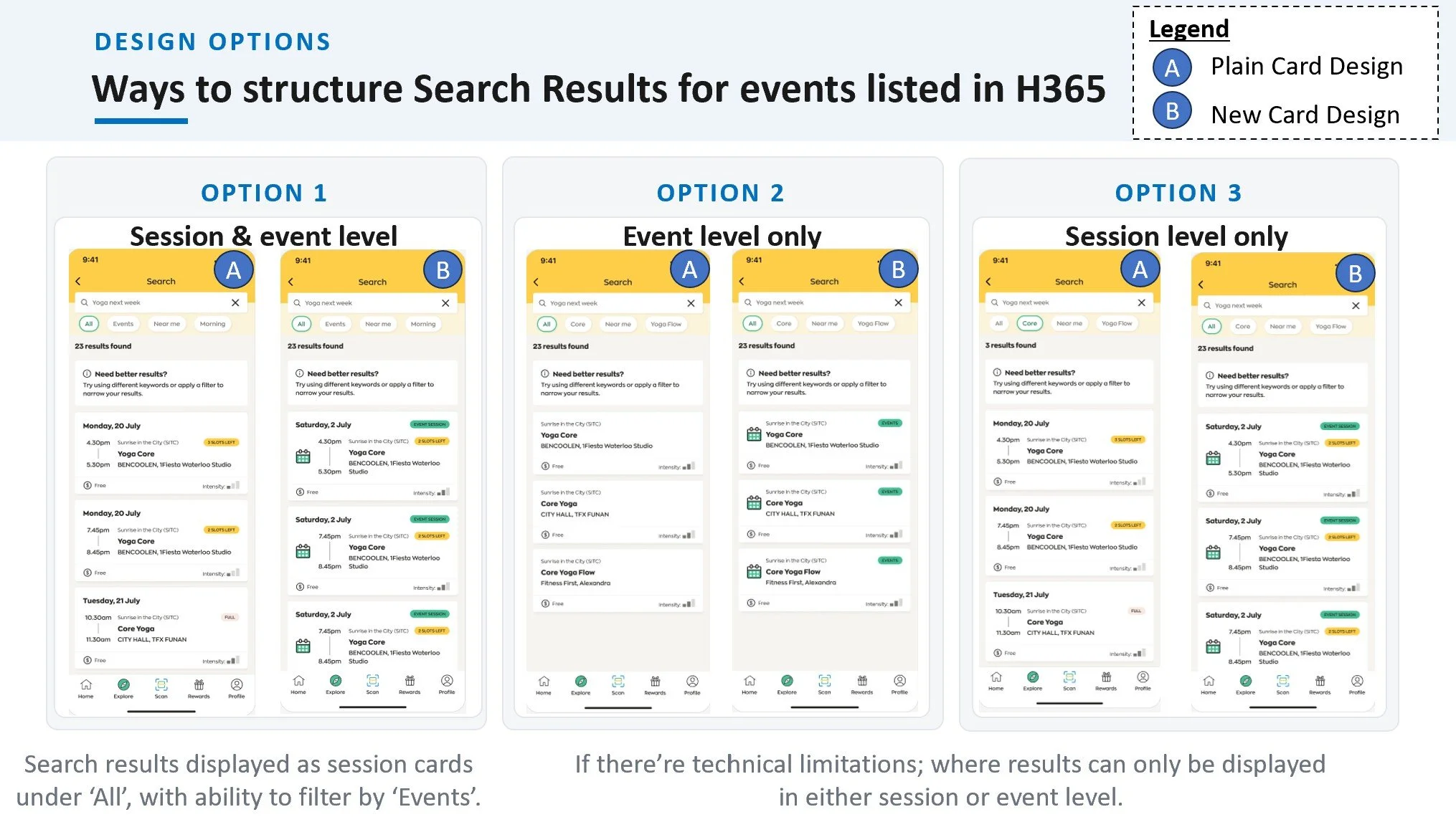
With a clear Research Traceability Matrix and concrete insights from market leaders like Grab and Deliveroo, I transitioned into the Ideation phase. Because this project focuses on enhancing an existing search feature rather than building an interface from scratch, I focused my ideation on structural layout strategy and information hierarchy.
My goal during this phase was to figure out how to seamlessly inject our new capabilities—prominent search entry points, lower interaction effort, and clearer guidance — directly into the current app architecture without confusing existing users.
To turn our "How Might We" statements into concrete features, I prioritized three core layout enhancements during my brainstorming sessions:
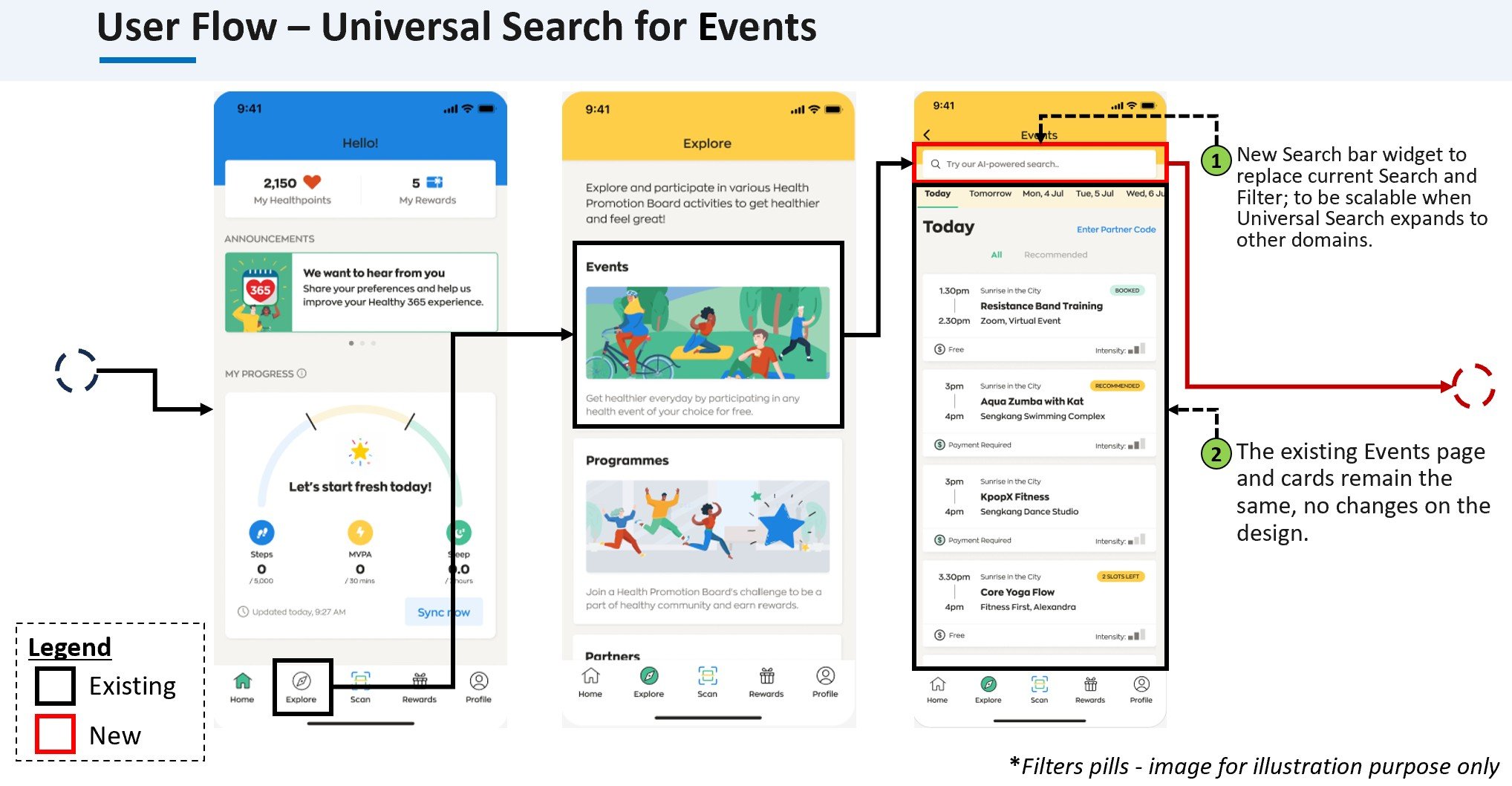
Centralizing the Entry Point: Moving the search function out from hidden sub-menus and anchoring it prominently where users instinctively look.
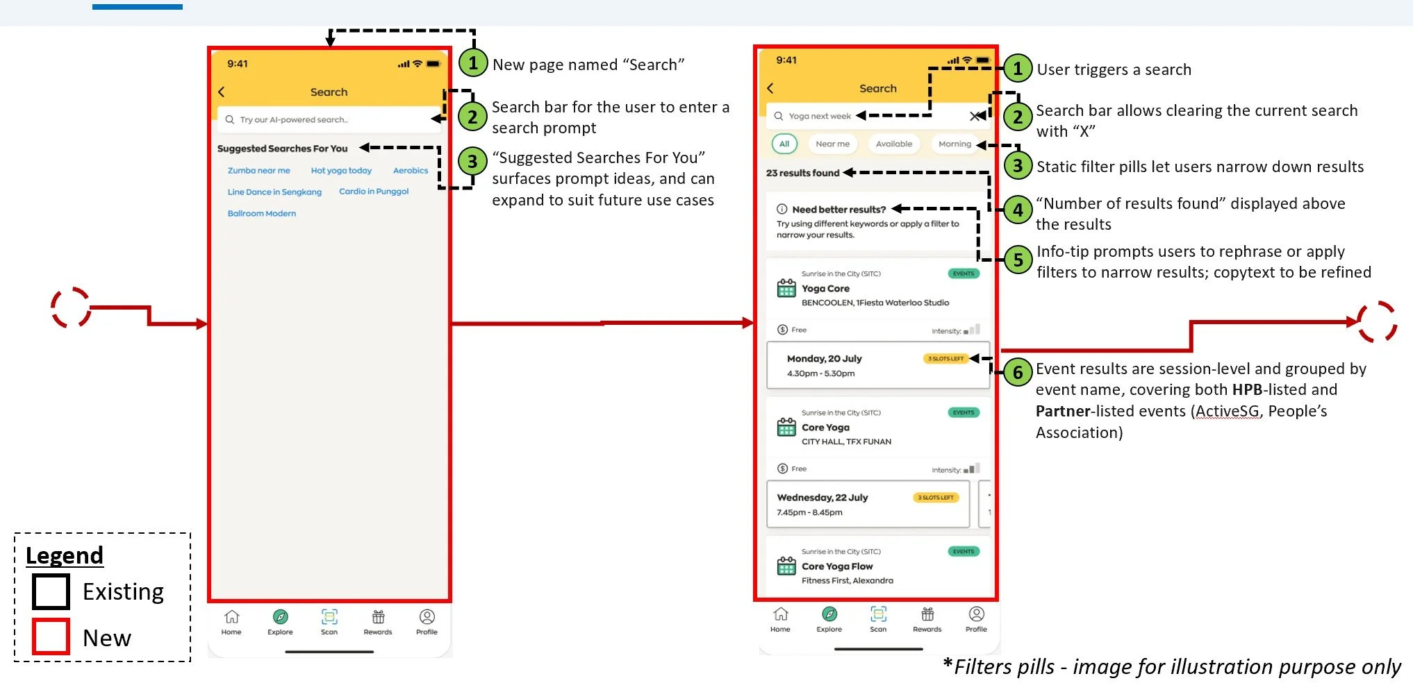
Streamlining Filter Mechanics: Ideating a system that allows users to toggle, add, or clear parameters instantly without triggering full-screen refreshes.
Surfacing Immediate Value: Restructuring the search results cards so that crucial details, success states, and primary actions are visible upfront.
Step 4: Prototype
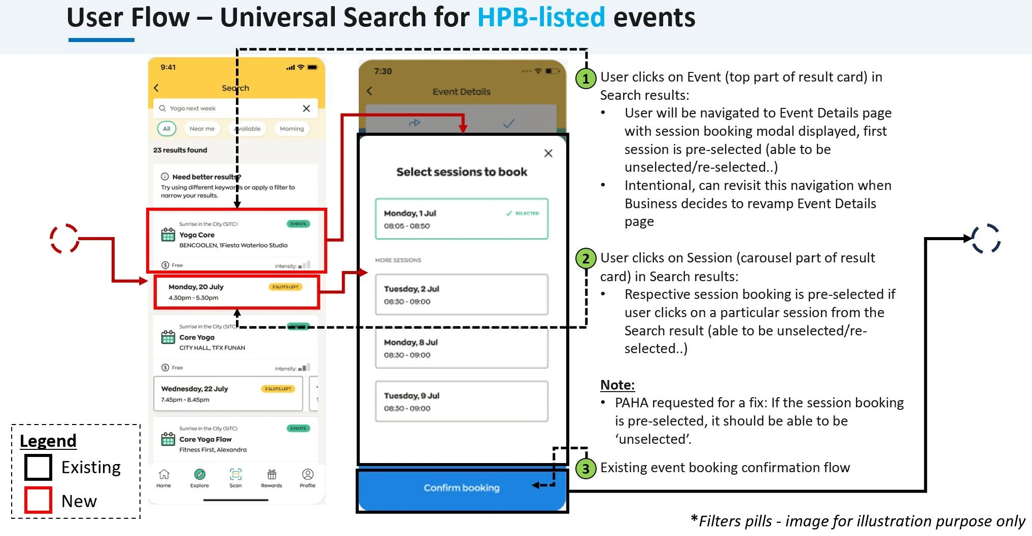
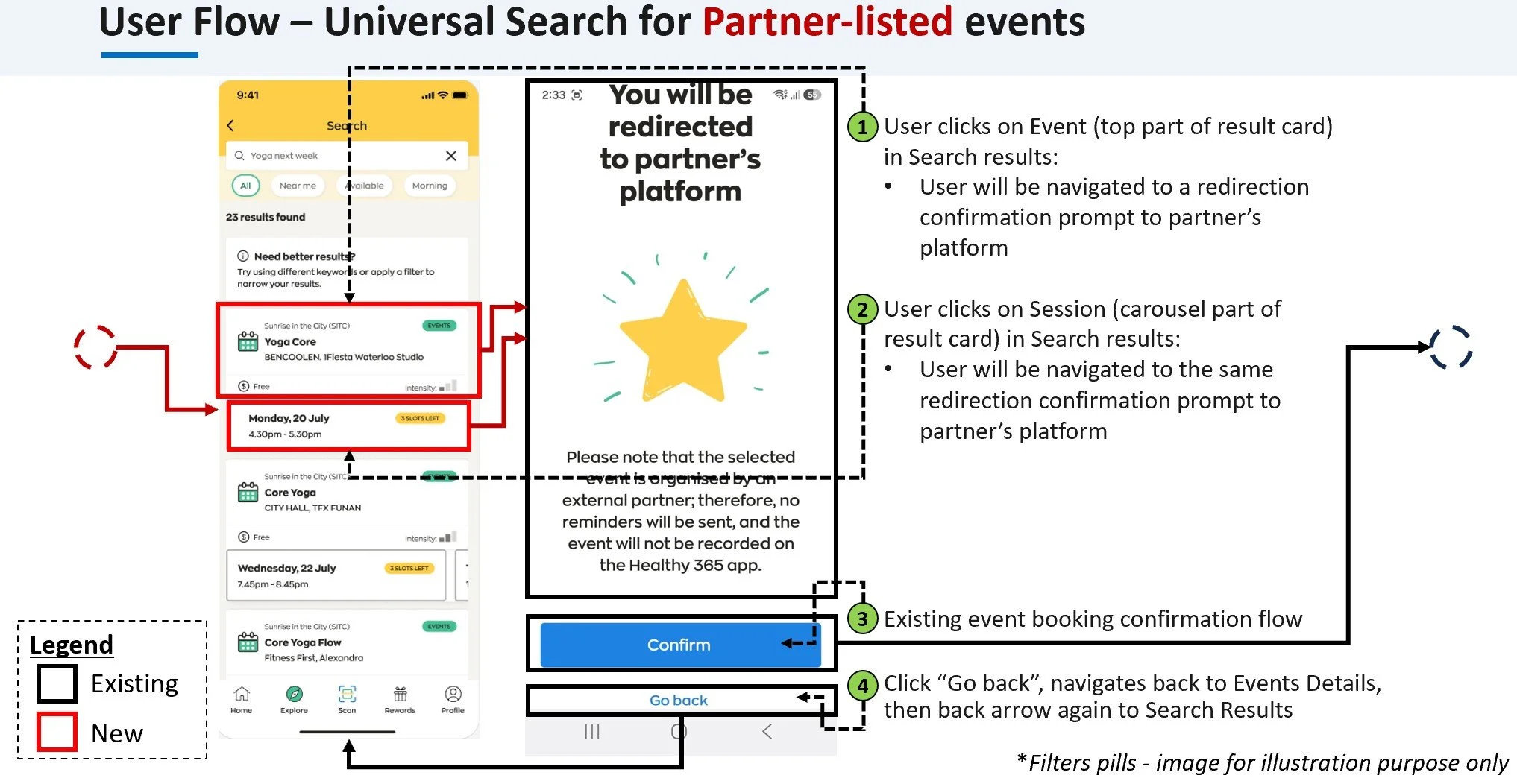
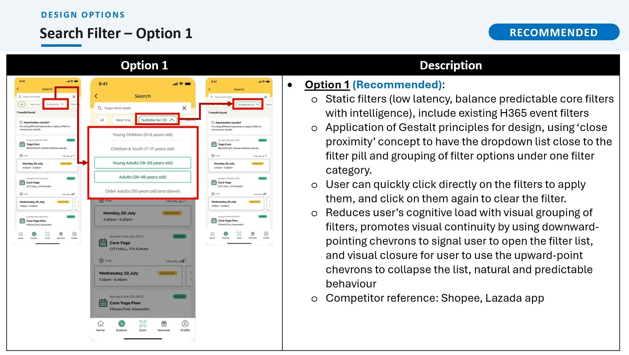
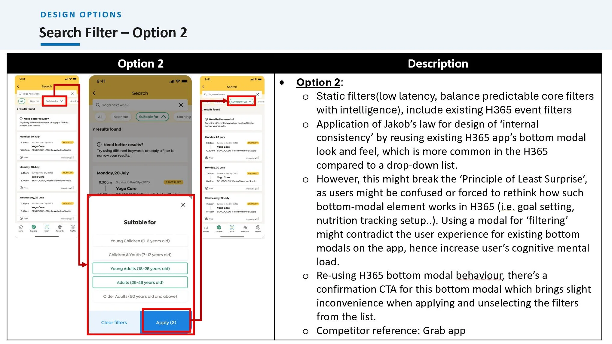
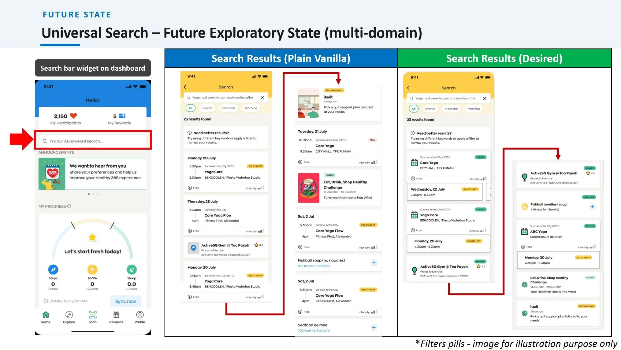
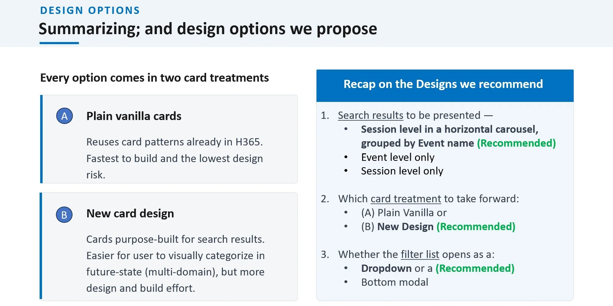
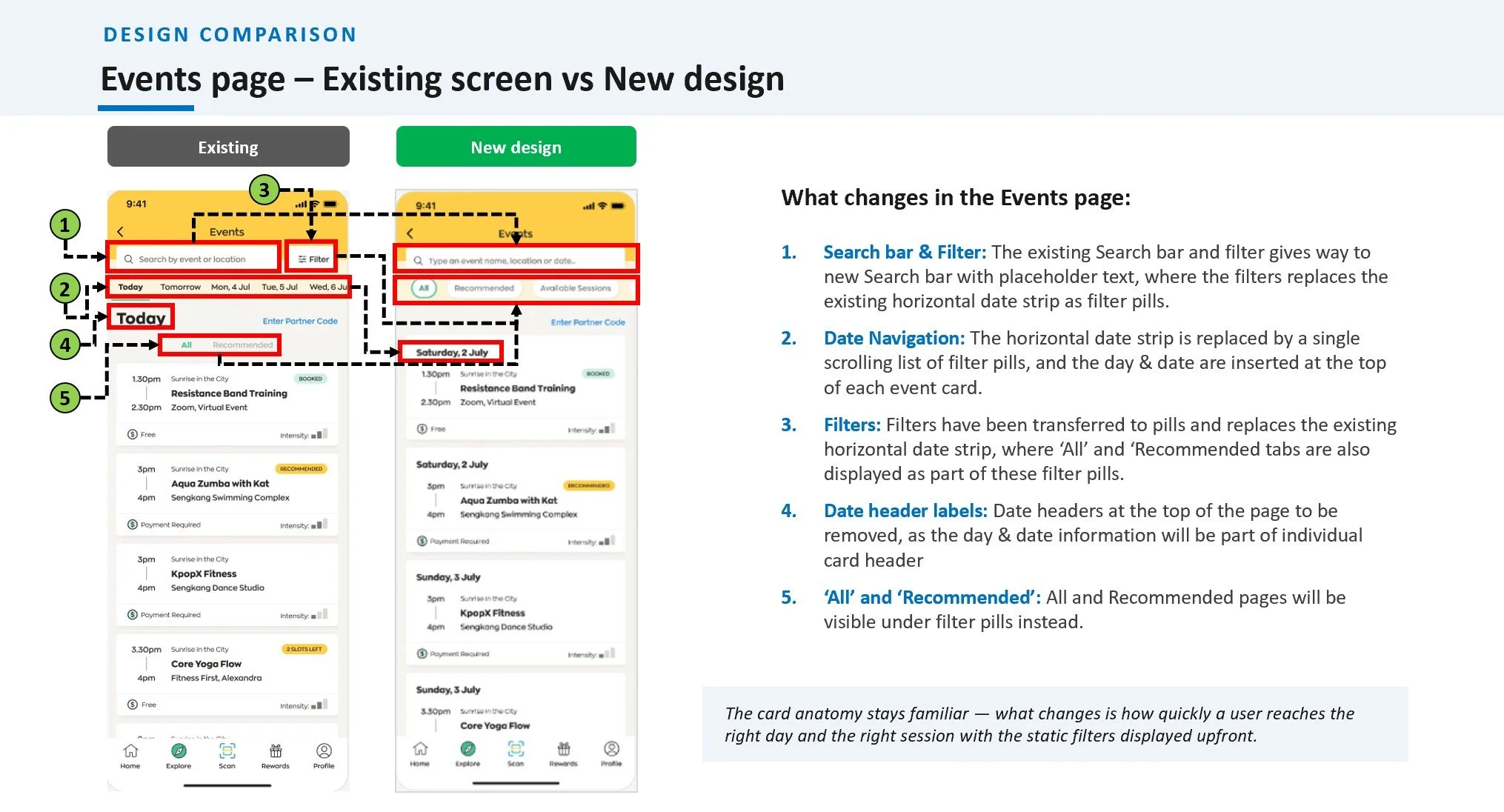
Once the recommended design direction was locked in, I mapped the finalized screens into comprehensive, end-to-end user flows. Instead of viewing the enhancement as an isolated screen, this ecosystem map traces exactly how a user transitions through the entire search, filter, and completion lifecycle. The following visual maps demonstrate how the new layouts operate seamlessly across our core application paths:
Step 5: Test – Stakeholder Review & Iterative Feedback
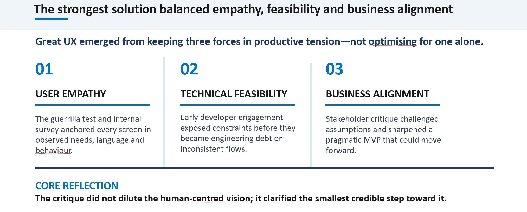
To validate the recommended design options before moving toward development, I presented the high-fidelity screens and user flows to key business, design, and technical stakeholders. The goal of this review session was to gather cross-functional feedback on technical feasibility, business alignment, and the overall flow of the proposed search enhancement. This collaborative review surfaced critical critiques that helped me balance Human-Centred Design (HCD) insights with real-world engineering and adoption constraints.
Key inputs from the stakeholder review session included:
Upfront Filter Accessibility (Business HCD Input)
Feedback: The business team highlighted that previous HCD findings required filtering capabilities to be surface-level rather than hidden.
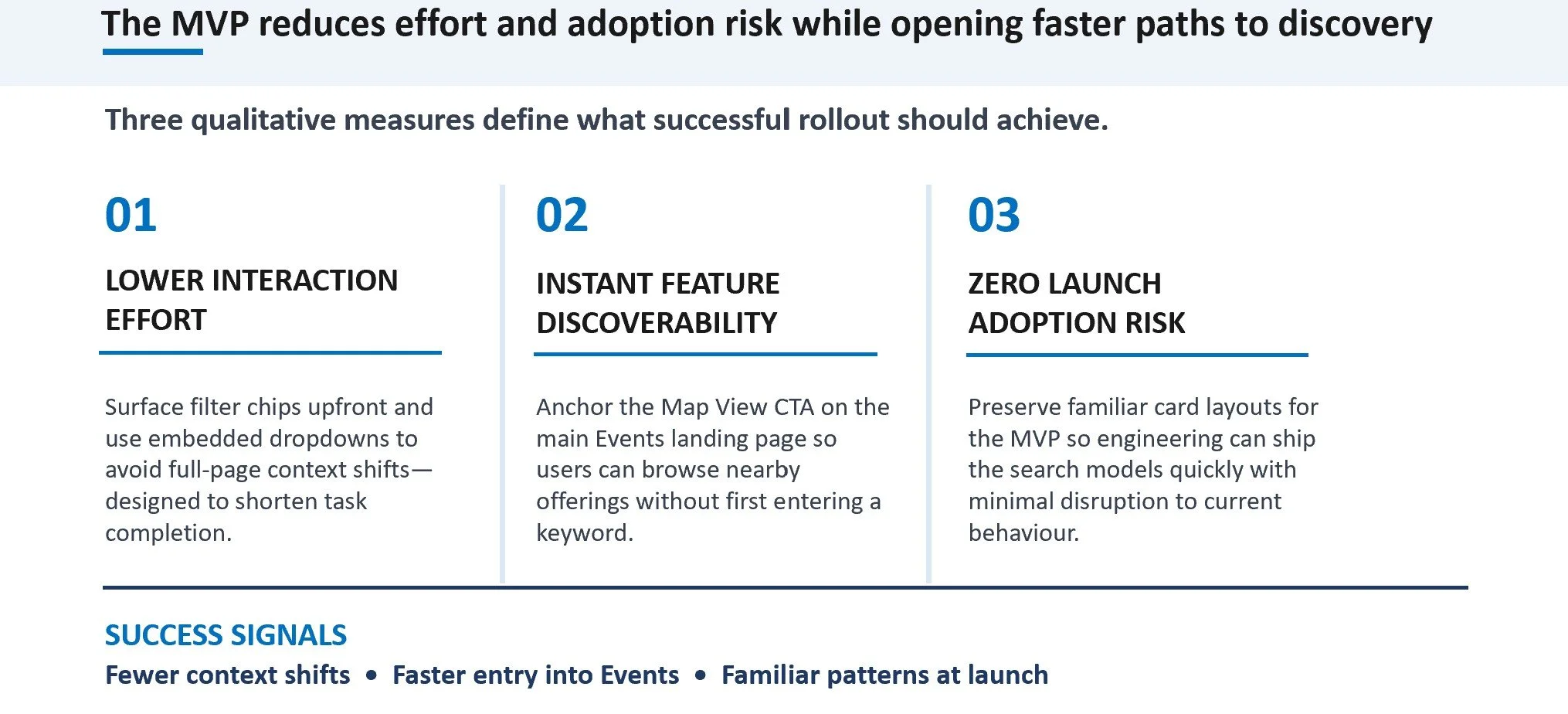
My Design Action: I introduced horizontally scrollable filter chips directly beneath the search bar, allowing users to view and apply key parameters instantly. For filters containing nested options, I designed integrated dropdown selection lists to prevent full-page context shifts.
Adoption Risks of New UI Patterns (UX Design Input)
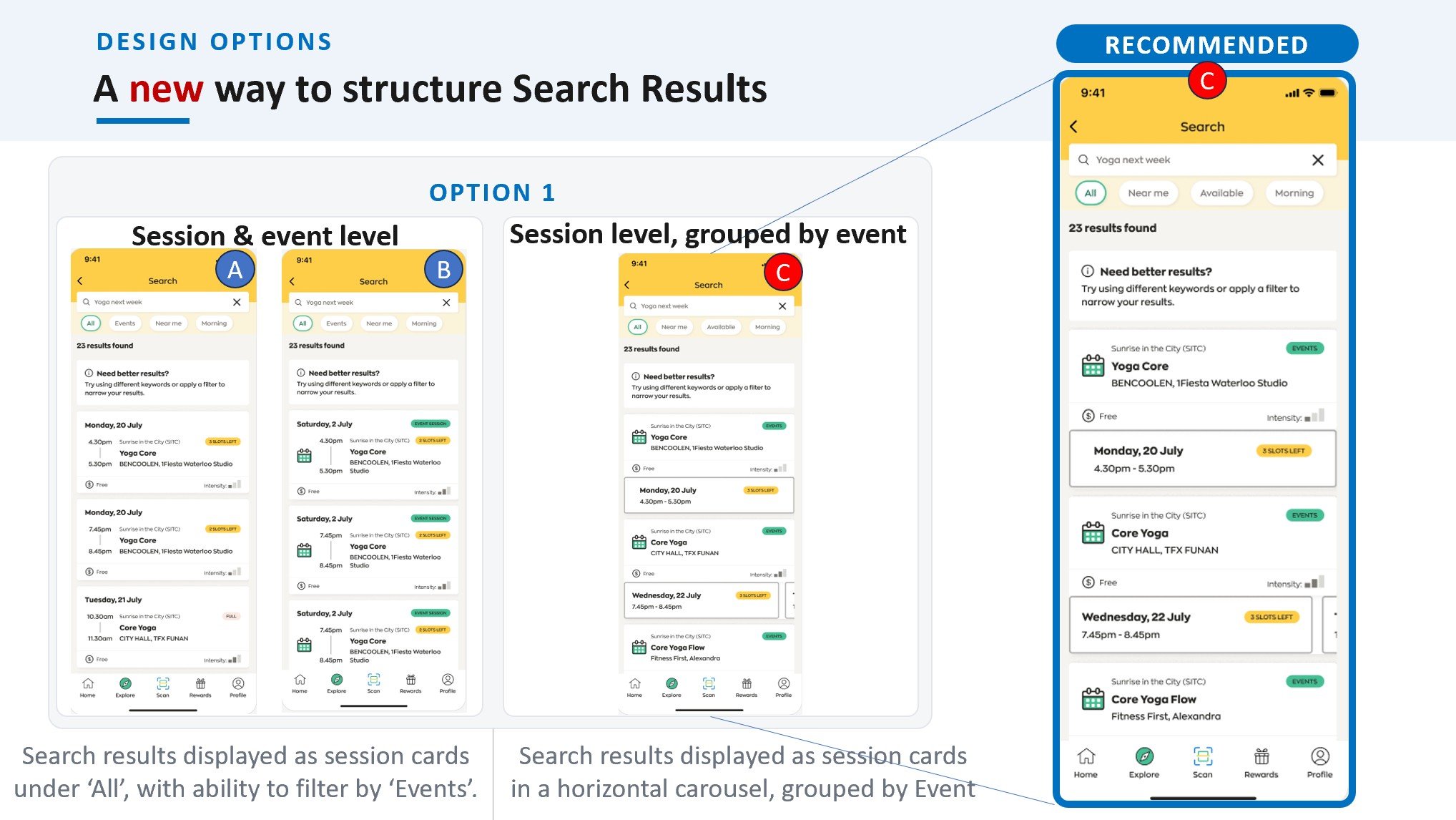
Feedback: The design team raised concerns that introducing horizontal scrolling carousels for the event sessions was an entirely new pattern that could disrupt existing user habits, noting that it required an in-depth usability study.
My Design Action: To avoid delaying the project, I proposed an MVP compromise: I kept minimal UI changes on the event result cards, allowing the engineering team to build the underlying search models while we run dedicated testing on the long-term design direction.
Discoverability of the "Map View" CTA (Business Input)
Feedback: Stakeholders voiced the need to make the existing "Map View" call-to-action immediately available to users.
My Design Action: Recognizing that this could significantly drive event discoverability, I anchored the Map View CTA directly onto the primary Events landing page. This empowers users to explore location-based offerings instantly without being forced to type a search query first.
Data Inconsistency Across Views (Technical Input)
Feedback: The engineering team flagged layout and logical inconsistencies between the search result listing view and the interactive map view.
My Design Action: I conducted target competitor benchmarking focusing purely on map-list sync workflows and generated a new set of layout options. I took an iterative approach, using these variations to drive a dedicated alignment session with the technical team.
Conclusion & Impact
Anticipated Product Impact
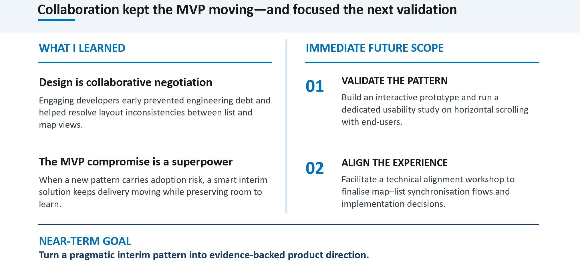
Takeaways and Next Steps