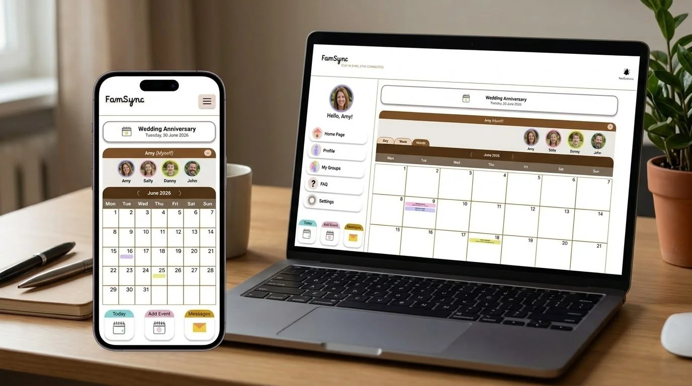
Extending FamSync Beyond Mobile
To complement the FamSync mobile app, I designed a responsive website that provides families with an additional way to access family scheduling information. The website introduces the FamSync concept, explains its key features, and provides easy access to the family calendar and supporting information.
My goal was to create a clear, intuitive and consistent experience across screen sizes while ensuring that the website's structure and navigation meet users' needs.
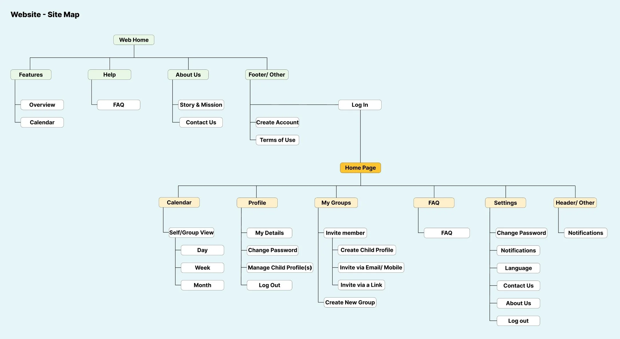
Organizing the Website Structure
I created a sitemap to define the website's information architecture and establish clear relationships between pages. This helped me organize content into meaningful categories and create a navigation structure that allows users to explore FamSync, understand its features, and access relevant information efficiently.
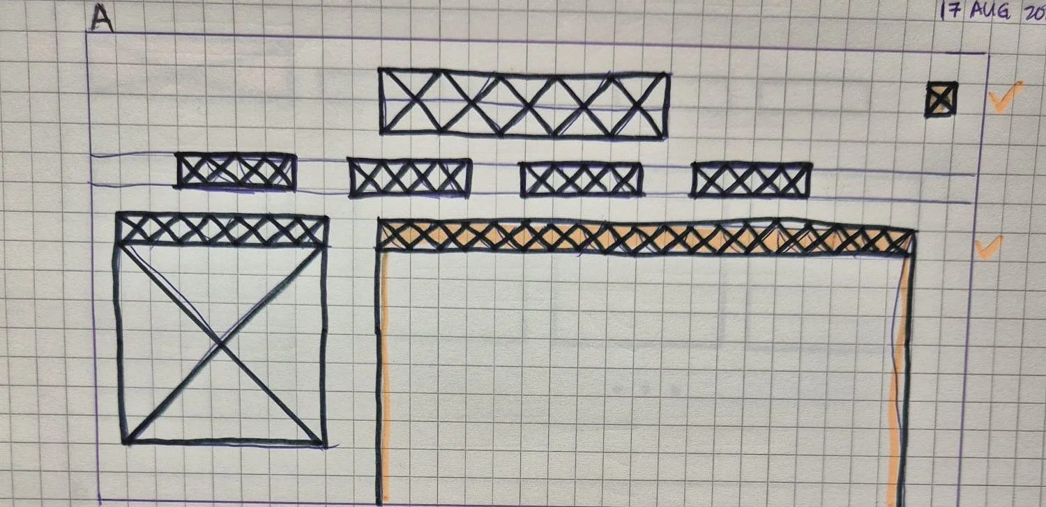
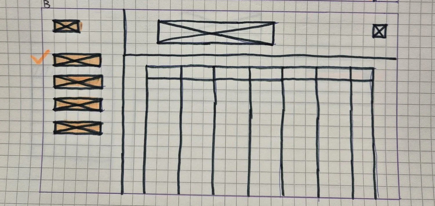
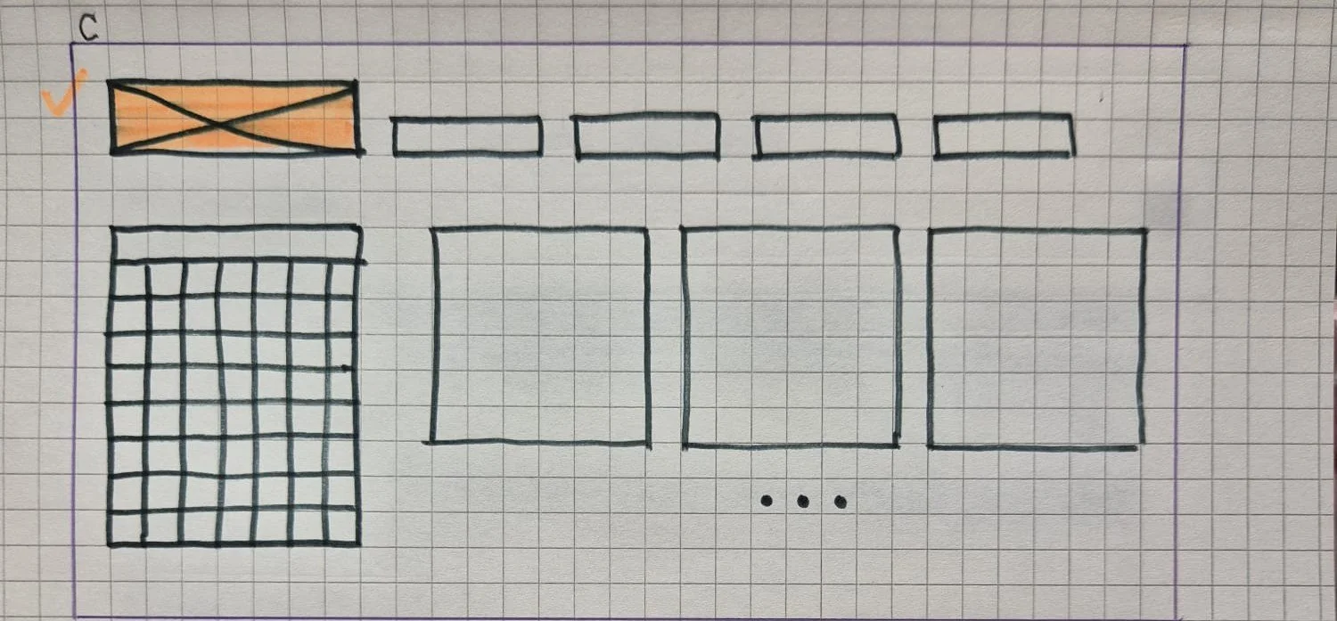
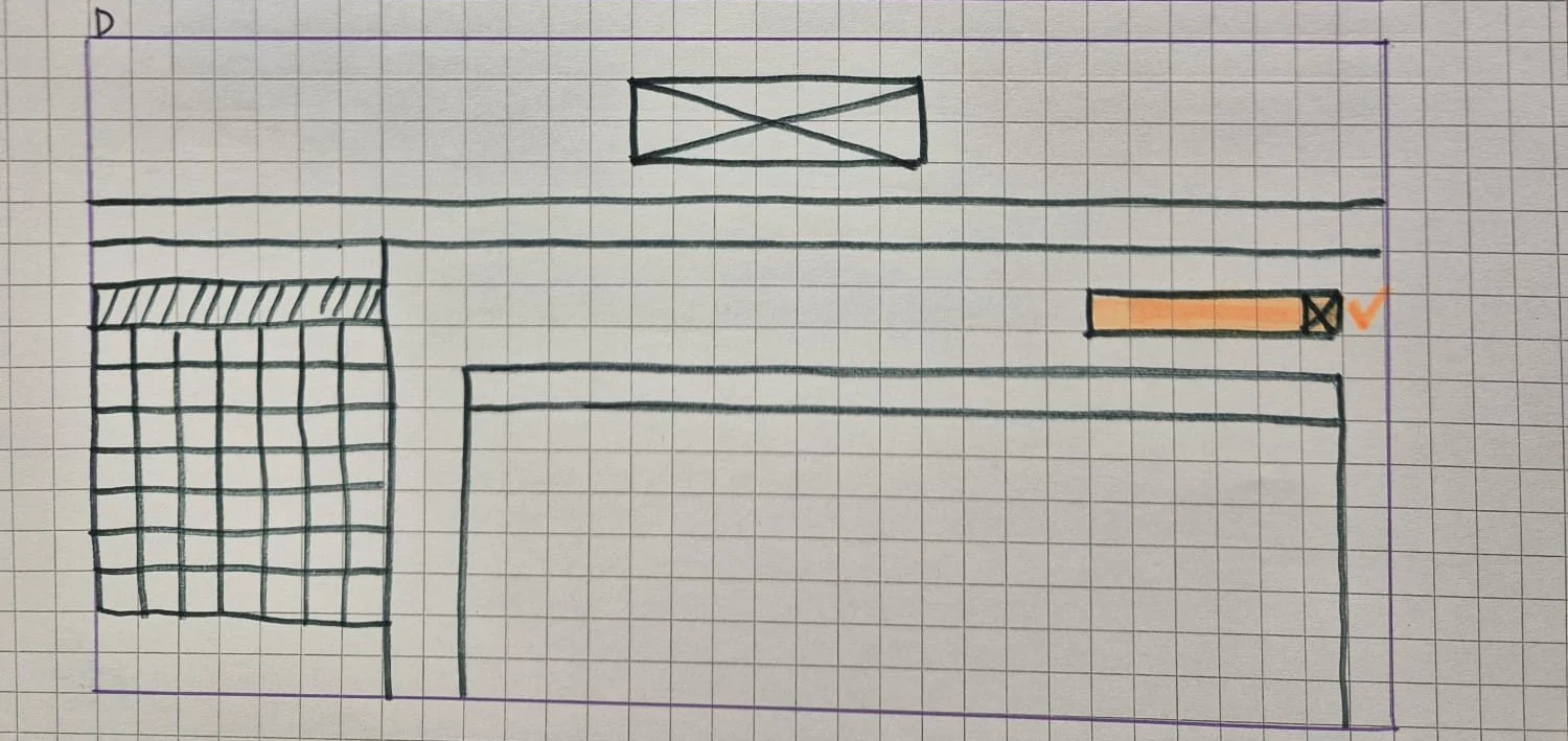
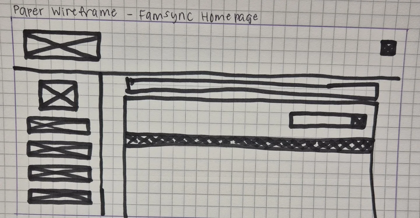
Paper Wireframing - Exploring Layout Possibilities
I sketched the initial website layouts to explore different ways of presenting content and structuring page elements. These sketches helped me visualize the placement of navigation, content sections and calls to action before moving into high-fidelity design.
This iterative approach allowed me to establish the overall page structure and refine the layout before investing time in detailed visual design.
Bringing the Design to Life
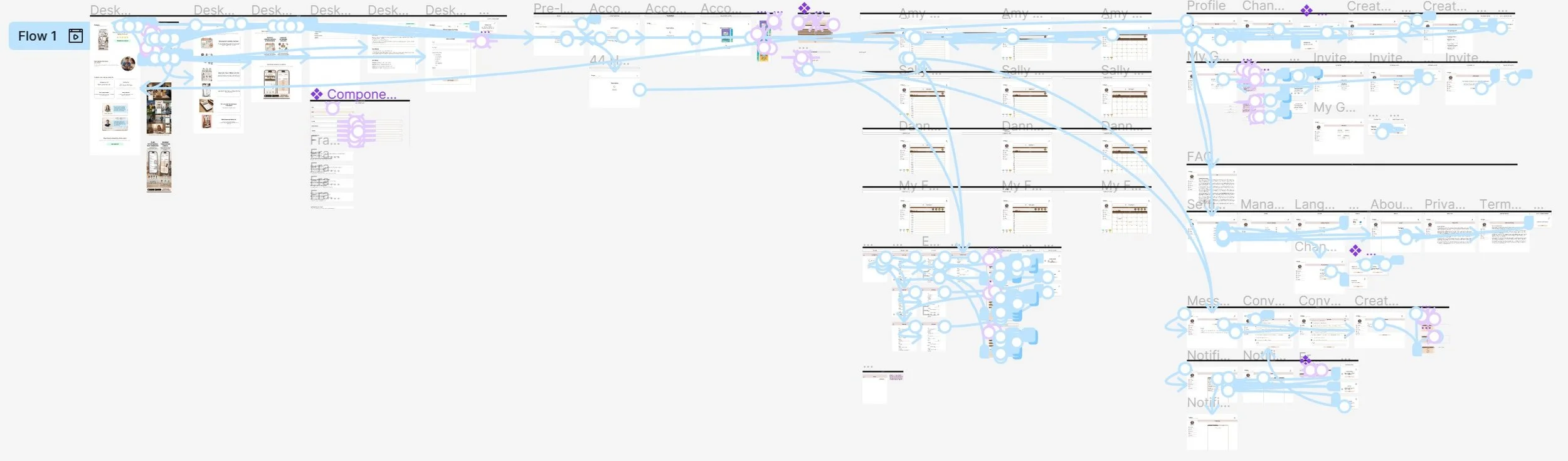
I translated the selected layouts into a high-fidelity Figma prototype, incorporating visual styling, page navigation and interactive elements. The website includes a Homepage, Overview, Calendar, FAQ, Story & Mission, and Contact Us page.
I focused on creating a consistent visual language and clear navigation throughout the experience, allowing users to understand the FamSync concept and explore its features with ease. I also added interactions in Figma to demonstrate how users would navigate between pages and engage with the interface.
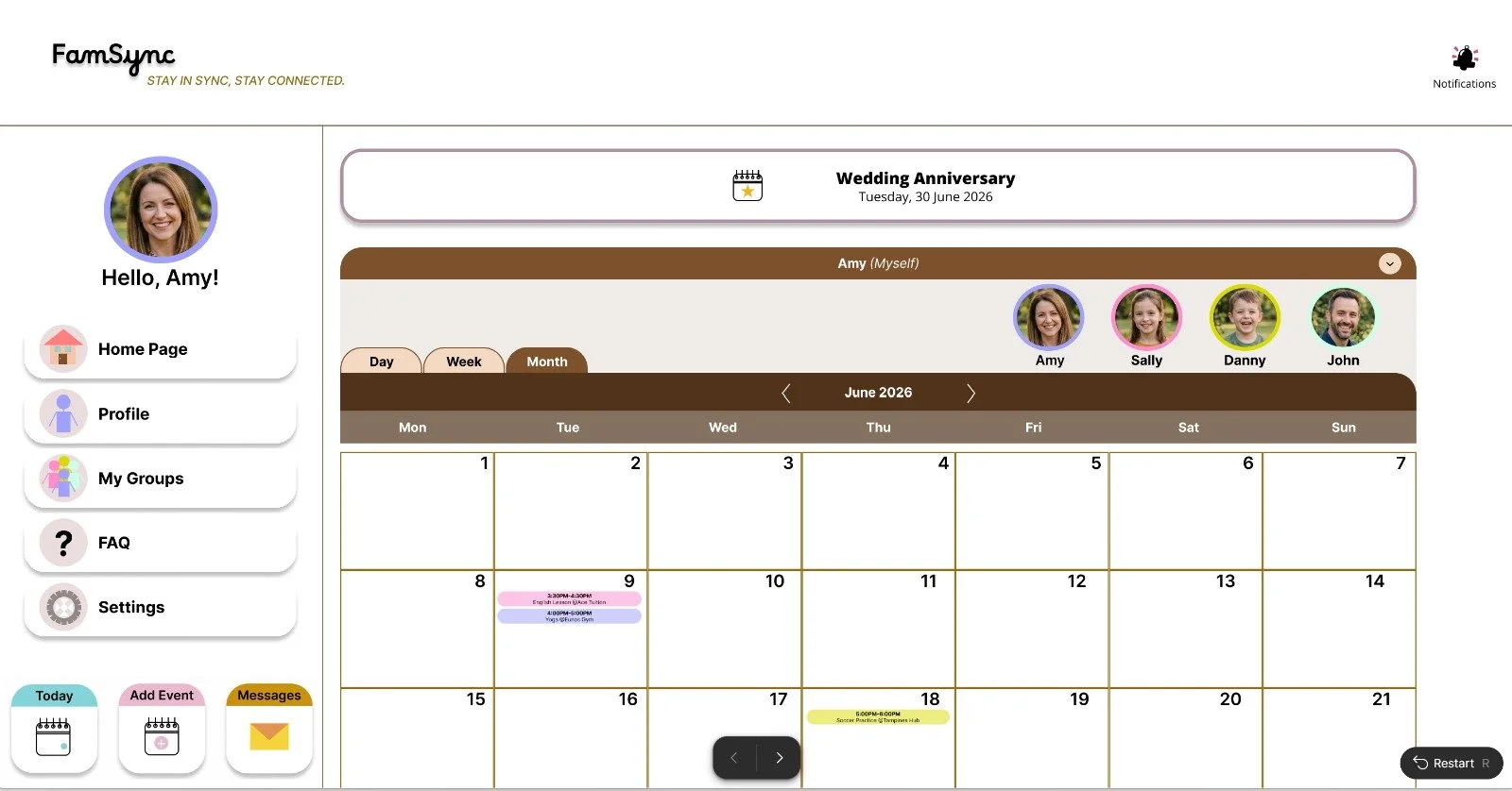
High Fidelity Prototype for FamSync Responsive