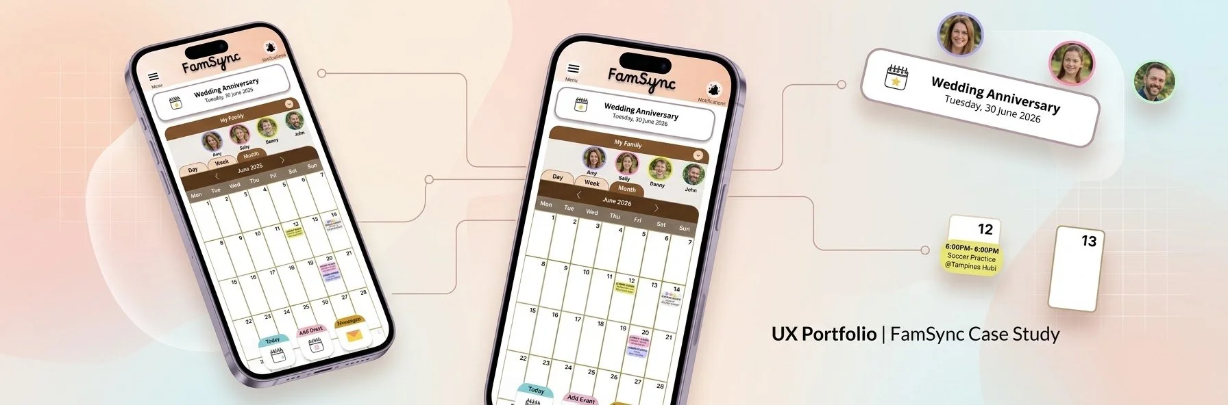
Google UX Design - Portfolio Challenge
September 2026
The Challenge
Designing a family schedule-management app and responsive website that lets parents manage their own schedules and their children in one place.

Design Thinking Process
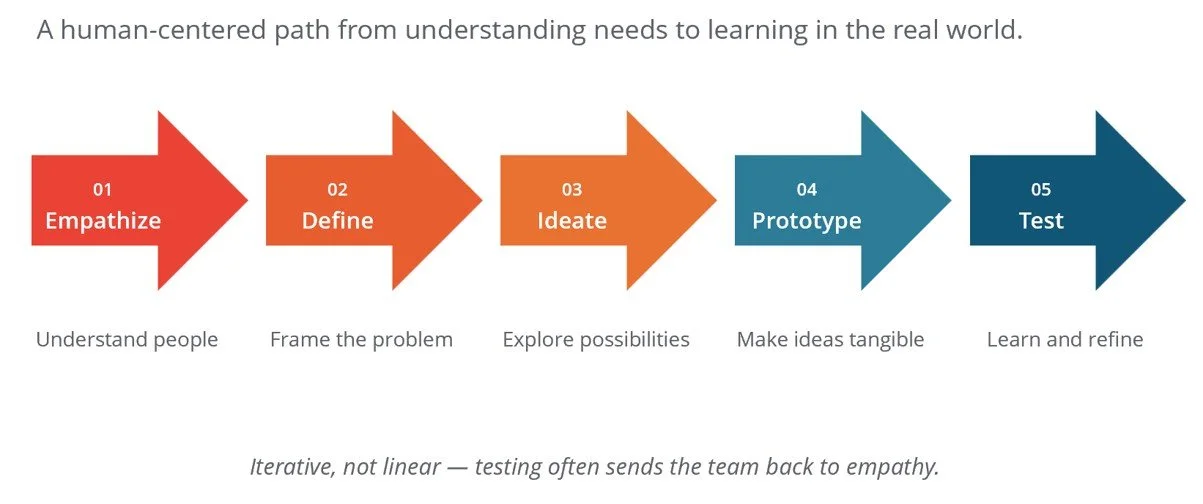
The Design Thinking Process was applied throughout the course of this portfolio challenge.
Step 1 - Empathize
I began with the assumption that the primary users were working parents with school-going children, and tested it through a round of user interviews. The research challenged that assumption. Participants described the same coordination frustrations with partners and elderly parents, and older children emerged as active planners who want a say in family activities. This reframed the audience from parents alone to the whole household, and pointed the design toward a shared schedule that every family member can view and contribute to.
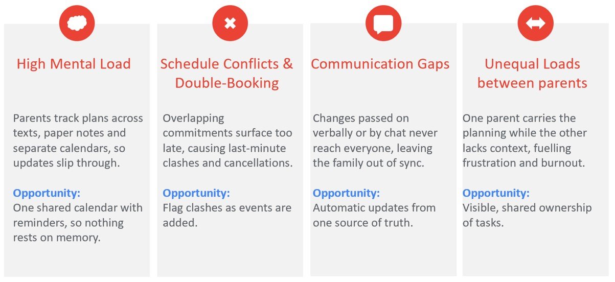
Through user research, I uncovered the moments of friction that shaped users’ experiences and brought their most pressing pain points into focus.
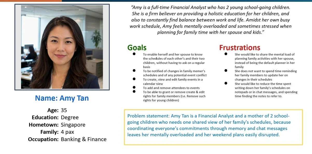
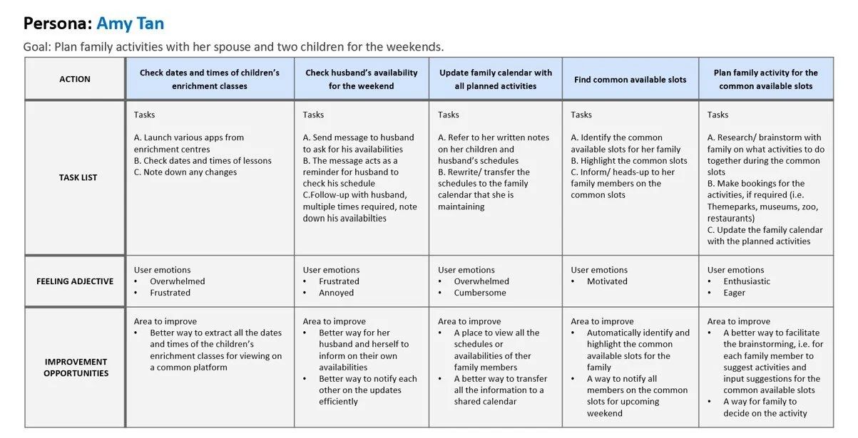
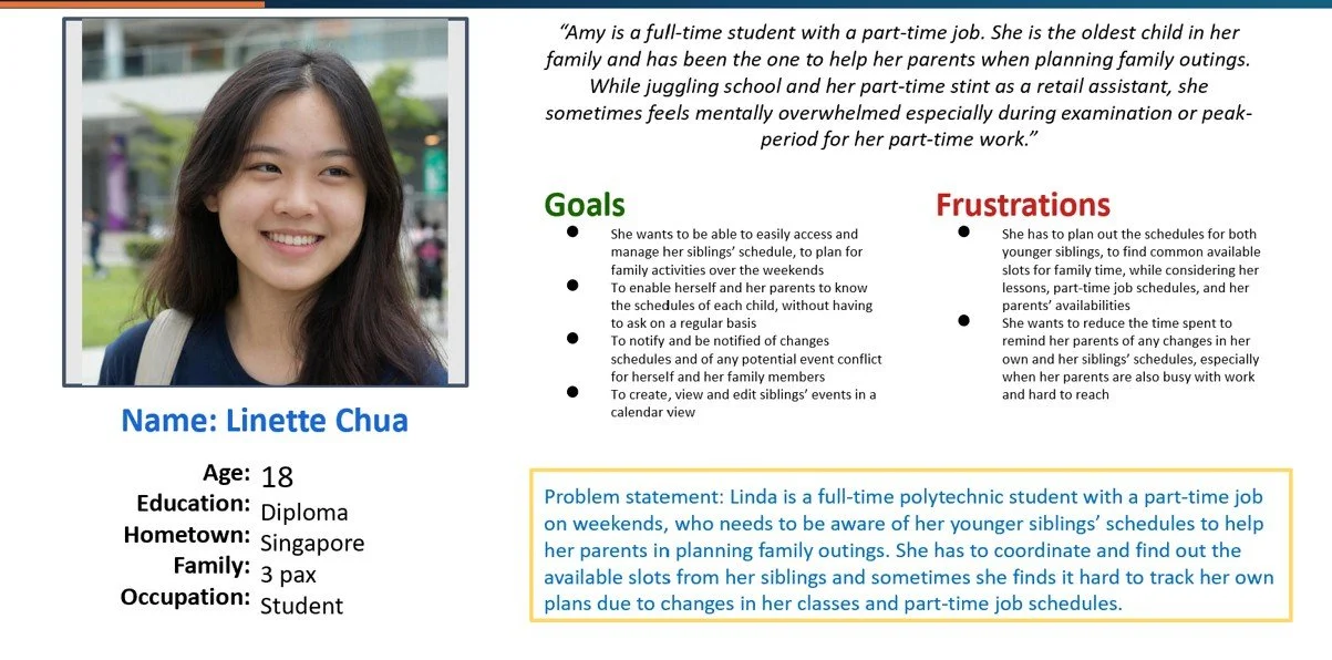
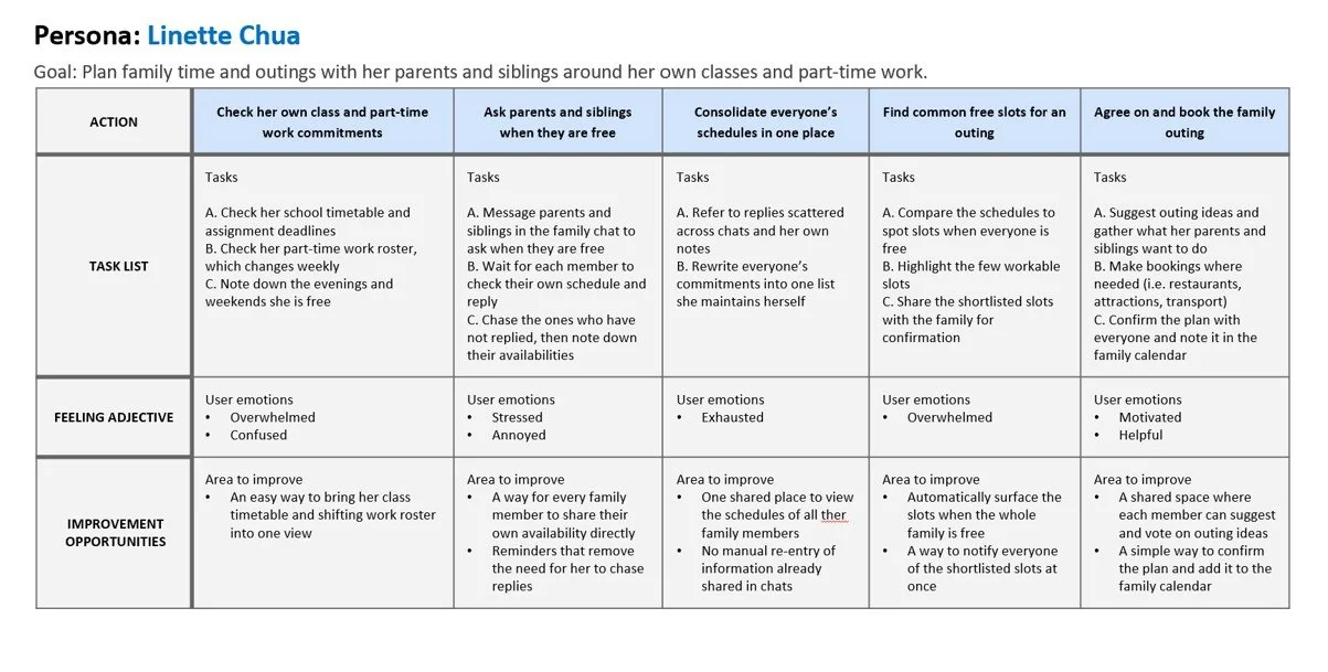
The information gathered from user interviews were used to create User Personas and the respective User Journey Maps. I have created two personas to help represent the target users by expressing their behaviors, frustrations and goals.
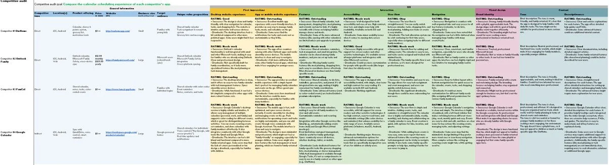
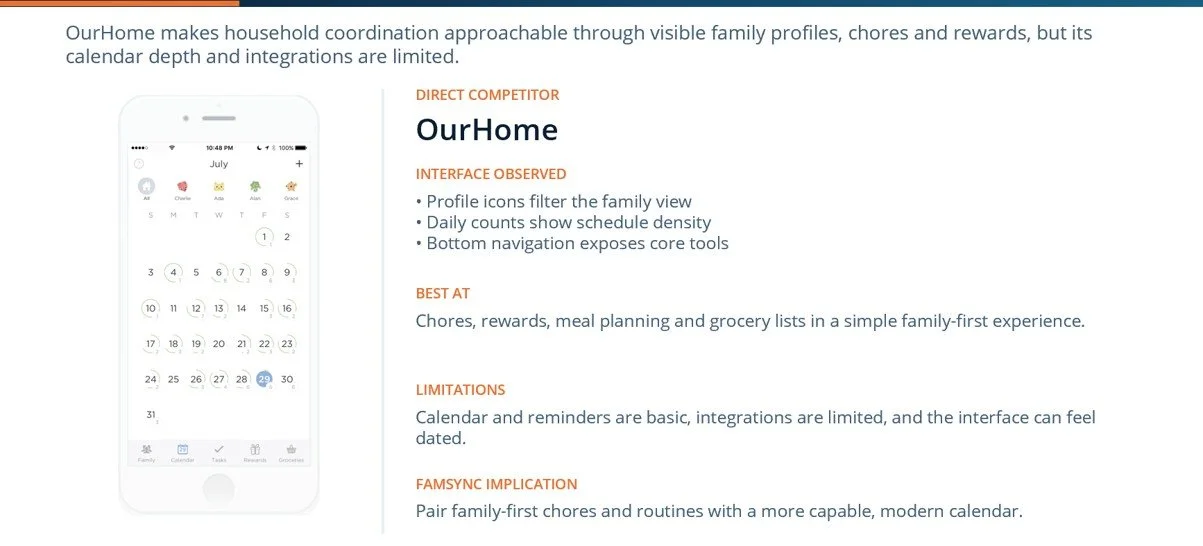
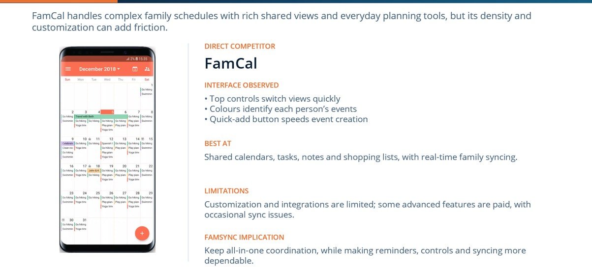
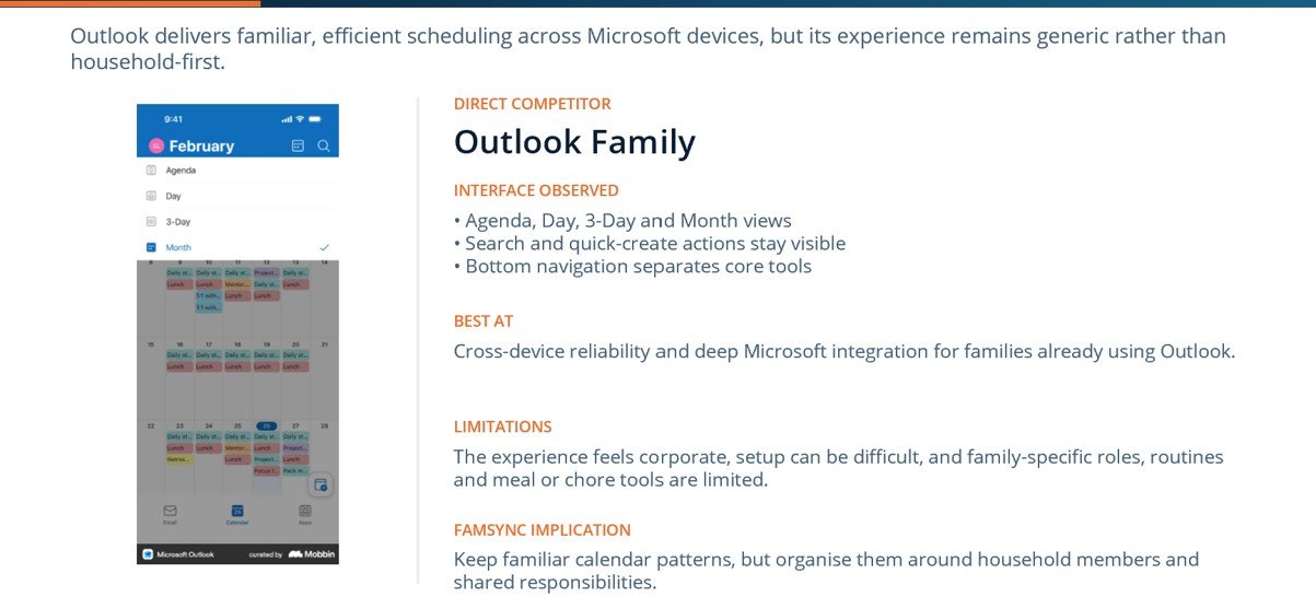
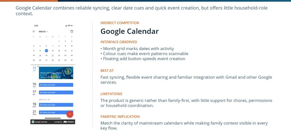
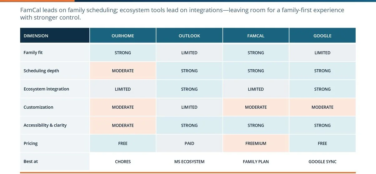
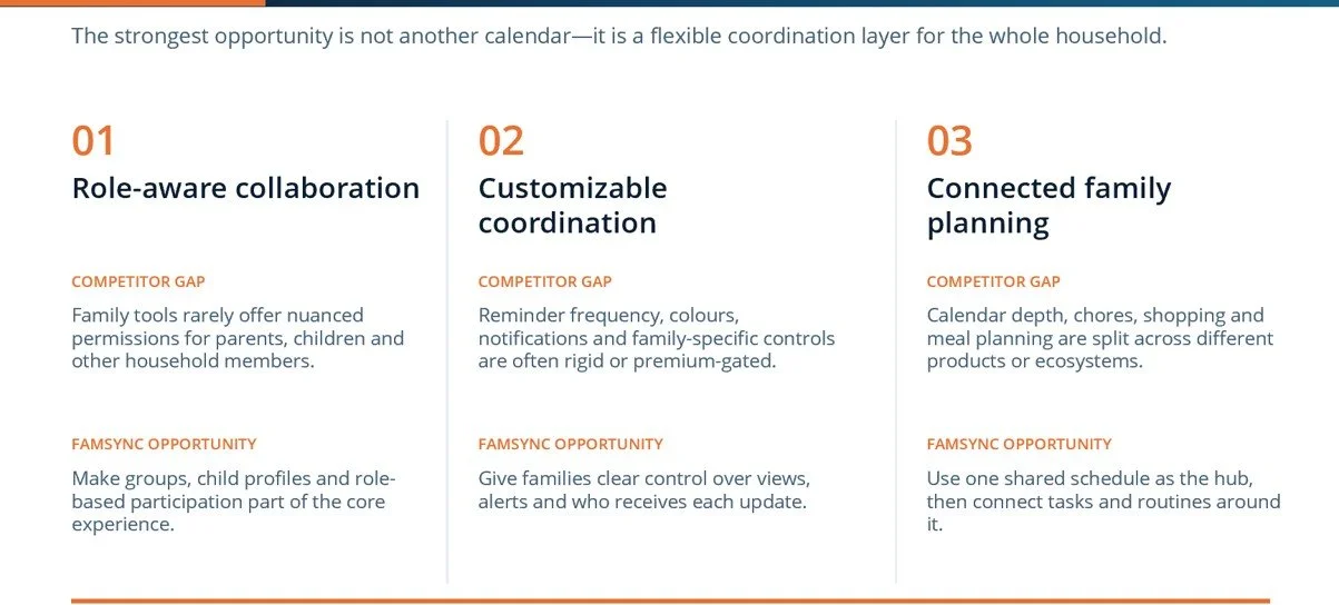
To identify market gaps and benchmark industry standards, I conducted a comprehensive competitor audit evaluating both direct and indirect solutions in our space. By analyzing their feature sets, user flows, and overall value propositions, I mapped out prevailing UX patterns alongside common user frustrations. The following results and insights highlight critical opportunities where we can differentiate our experience and better address our users' unmet needs.
Step 2 - Define
By synthesizing my user research insights, I define my problem statement. Then, I transform the problem statement into actionable How Might We (HMW) statement by reframing those user pain-points into open-ended design opportunities for brainstorming.
Problem Statement
Busy families need one shared way to manage everyone’s schedules because coordinating through memory, chats, paper notes, and separate calendars creates mental overload, missed updates, and scheduling conflicts.
How Might We (HMW)
How might we help every family member jointly view, update, and coordinate a shared schedule so the right people receive changes and conflicts are identified early?
Step 3 - Ideate
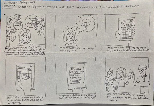
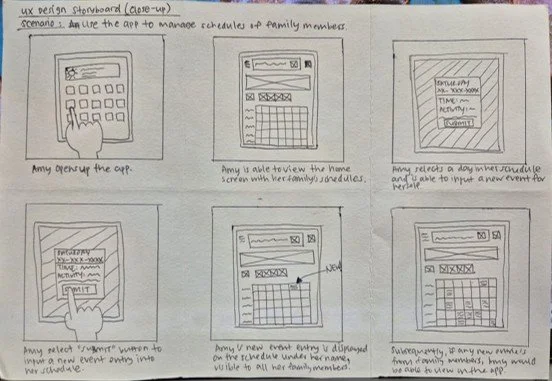
To visualize how the proposed solution fits into the user's daily life, I mapped out the end-to-end user experience using both big-picture and close-up storyboards. The big-picture narrative focuses on the emotional context, triggers, and high-level environment of the user, while the close-up panels detail the specific digital interactions and functional user flows. Below are the sketches of these storyboards, illustrating how the concept seamlessly addresses our defined user needs.
Step 4 - Prototype
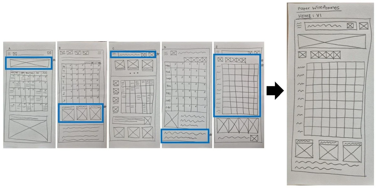
Following the ideation phase, I transitioned from abstract ideas to concrete layouts by creating paper wireframes and low-fidelity prototypes. This fast, low-stakes approach allowed me to rapidly experiment with content hierarchy and core navigation without getting distracted by visual design details. The following screenshots and photos display my initial sketches, which served as a crucial tool for quickly testing and refining the basic structure of the interface.
Step 5 - Test
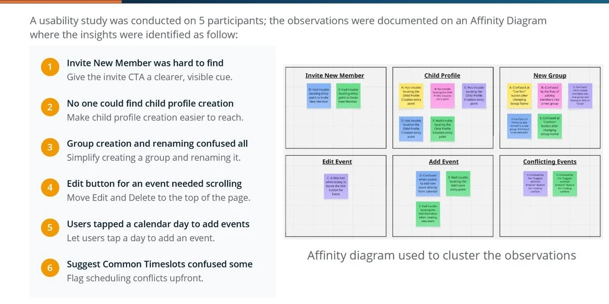
To validate my initial design concepts, I conducted a usability test with 5 participants. I observed their behaviours, recorded their challenges, and documented my observations on an affinity diagram to cluster the data into clear themes. This synthesis revealed six critical usability findings, which directly informed my next design iterations.
Step 5 - Design Iteration
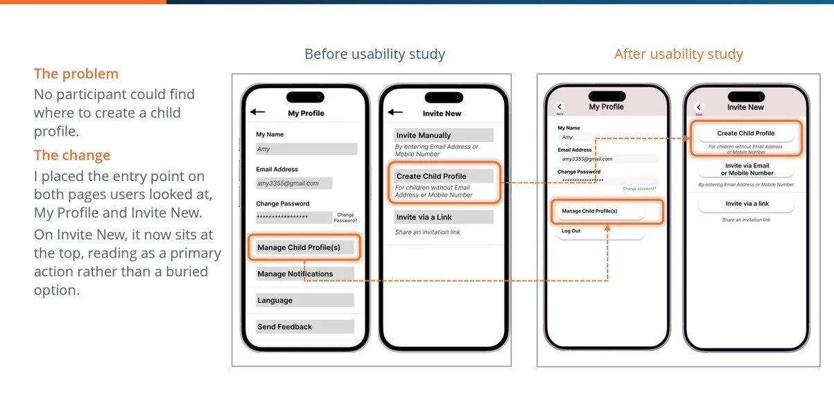
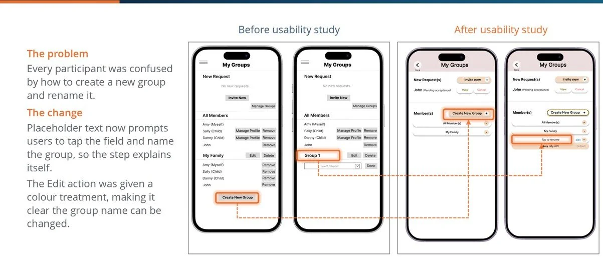
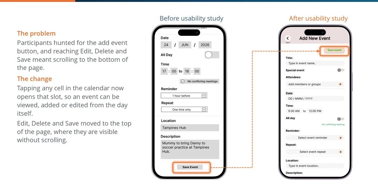
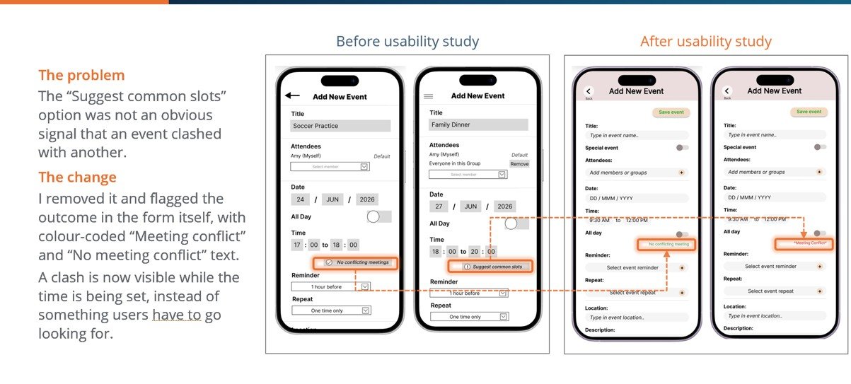
With clear, data-driven insights from the usability study, I transitioned from low-fidelity wireframes into high-fidelity digital mock-ups. Using the feedback gathered from my 5 participants, I directly applied the necessary design solutions to resolve navigation issues, clarify hidden entry points, and smooth out interaction friction. By layer-adding typography, visual hierarchy, and our brand's design system to the validated layouts, I transformed the rough concepts into polished, production-ready interfaces that are both functional and visually engaging.
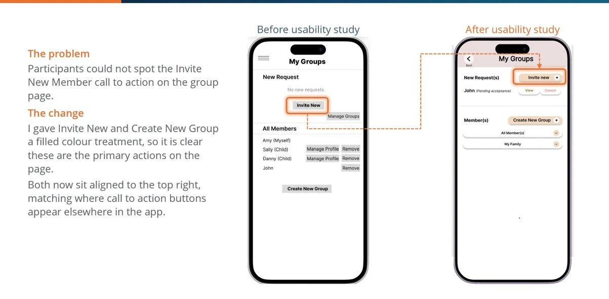
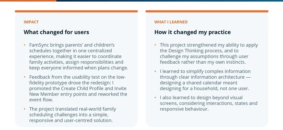
To demonstrate how user feedback directly shaped the final product, I mapped the key friction points from the low-fidelity prototype directly to the updated high-fidelity interfaces.
Below are the key transformations made to improve the user experience:
High-Fidelity User Flows
To demonstrate how the finalized interface design functions as a cohesive system, I mapped our completed high-fidelity screens into end-to-end user flows. These visual maps trace the polished screens chronologically through our primary tasks, proving that the updated visual hierarchy and navigational fixes operate flawlessly across complex user paths.
Below are the step-by-step high-fidelity flows for our core app experiences:
Invite New Member Flow: Displays the seamless path to send a joining request, highlighting flexible omni-channel options to invite users via email, mobile number, or a direct copied URL.
Create Child Profile Flow: Highlights the highly discoverable entry points I introduced, allowing users to initiate the child profile creation seamlessly from either the 'My Profile' dashboard or the 'Invite New' page.
Create New Group Flow: Visualizes the intuitive step-by-step interactions required to establish a brand-new group, dynamically add or remove group members, and modify the group's name.
Add New Event Flow: Details the optimized data entry fields, the prominent and fixed 'Save Event' call-to-action (CTA) anchored at the top of the page, the immediate success prompt upon saving, and the final look of the published event.
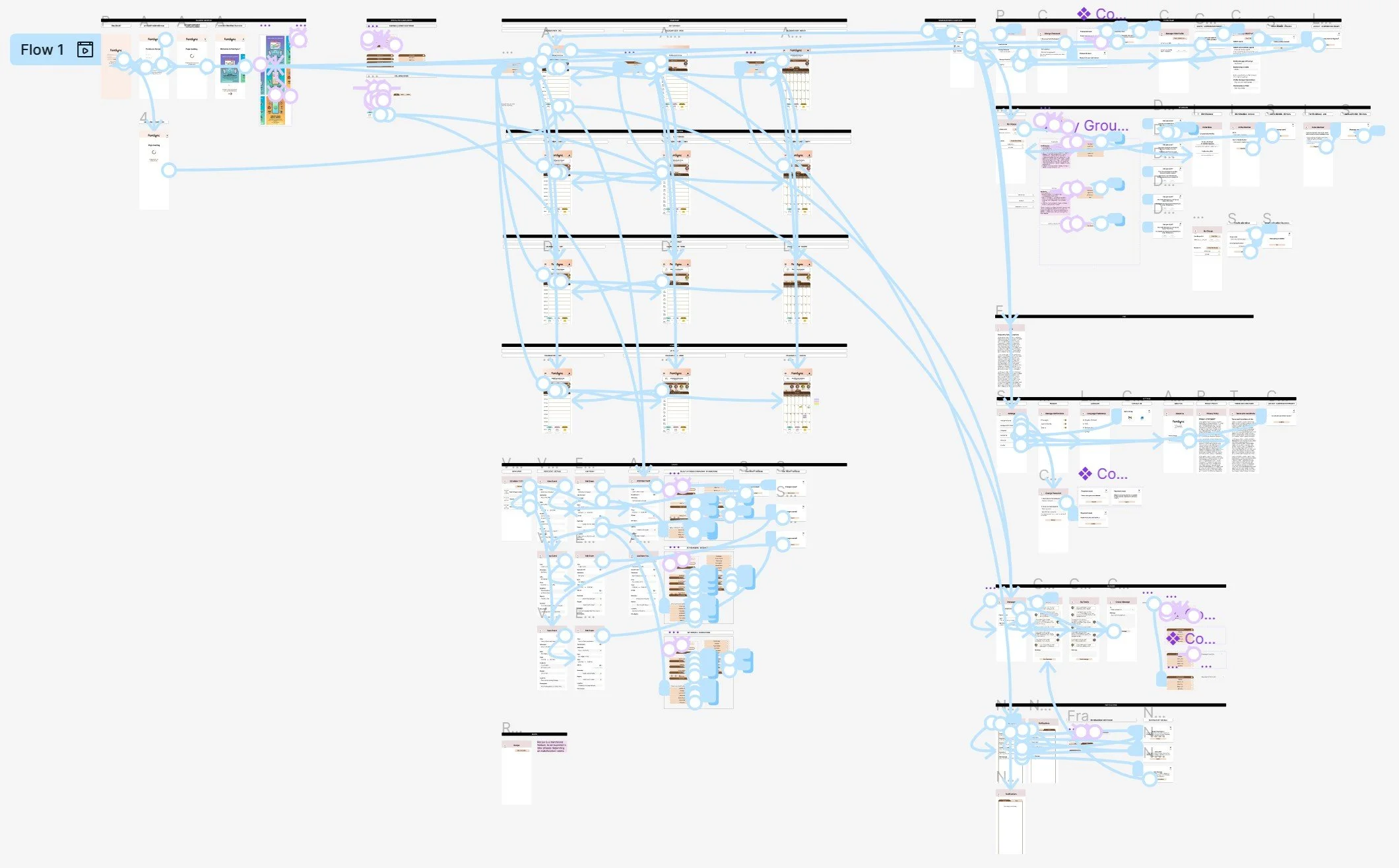
The Full-interactive Flow
View the high-fidelity prototype HERE.
Accessibility Considerations
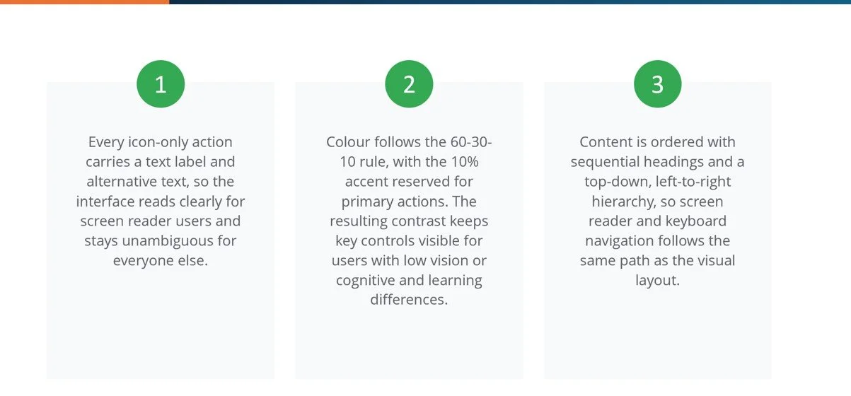
Screen Reader Compatibility & Text Labels: I paired every icon-only action with descriptive text labels and alternative text. This ensures the interface remains clear for screen reader users while eliminating ambiguity for all other individuals.
Strategic Color & High Contrast: I applied the 60-30-10 color distribution rule, reserving the 10% accent color strictly for primary actions. The high-contrast palette keeps essential controls highly visible for users with low vision or cognitive differences.
Predictable Reading Hierarchy: I structured all content with sequential headings using a strict top-down, left-to-right hierarchy. This supports assistive technologies—like screen readers and keyboard navigation—follow the exact same logical path as the visual layout.
Takeaways
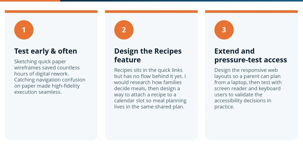
Next Steps